A couple of quite different books just completed. The Abrahamic Archetype was commissioned by Archetype publishers in London for whom I have worked for many years. Archetype appreciate nice typesetting and have an experienced eye for detail. Baskerville is a typeface which never fails either as a display face or for text. In this case Baskerville was used on the cover and my own edited pro font of Bembo for the inner pages.
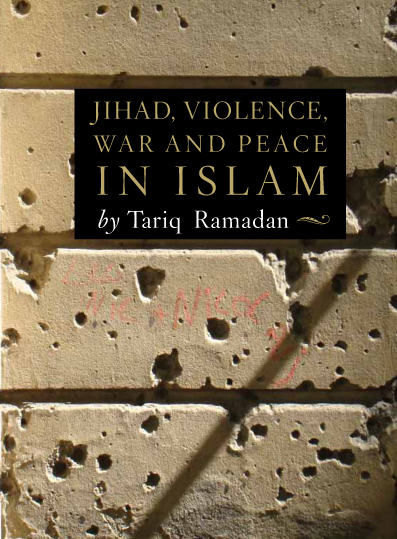
The second book was designed for Awakening in Swansea and is by Professor Tariq Ramadan. Hard not fall into clichés with emotive words like Jihad and Violence in the title. I dodged the obvious and ended up with an image of what happens after war and violence has left its mark. This image is of a wall in Berlin with bullet marks from the last war. If you walk round Berlin you will still see such traces of the last world war on bridges and walls. As there were so many words in the title it was straightforward to make a feature of it with a classic Roman typeface. I was quite pleased with this having almost given up trying to find a solution. It’s suitably sober but a nice image nonetheless.


That subtle red graffiti really makes it happen, helping it not be too matchy.