The Style
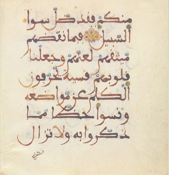
The initial impression of ancient Andalusi scripts is of something beautiful and dynamic, executed quickly and accurately but also with a free spirit, each calligrapher creating their own unique ligatures and flourishes, though still somehow within the compass of the style. The colour of the ink varied from black though to brown, possibly from burnt sesame with a natural variation caused by the ink’s varying density. Those familiar with common arabic would need to get used to certain differences like the fa being dotted below the letter and the qaf being dotted above the letter. But also the many variants of the tarmabuta and the curious stress with which many letters like the alif begin with and the curl of the basic ba form at the beginning of a word. Close study unveils all these little secrets.
[Above: A page of simple Andalusi letter forms by the author using a felt tip pen on ordinary paper used as a teaching aid]
For anyone wanting to unravel all the different Andalusi letter variations I can recommend (url below) a useful essay from a Dutch researcher named Boogert who analysed some Andalusi scripts. His work helps to unknot some, but not all, of the more obscure letter configurations:
http://www.islamicmanuscripts.info/reference/articles/boogert_notes_maghribi_script.PDFI I think this document was designed for researchers and translators trying to decipher old manuscripts rather than an aide for calligraphers but I have found it very useful all the same.
Materials
Without doubt cane reeds would have been used though exactly what these were like we can only guess at. Some suggest the calligraphers of that pre-reconquista period in Spain wrote with a flat reed with a stub end rather like a felt tip. Not like the relatively sophisticated pens used by the Ottomans with their clear angle-cut reed tips. My guess is that most calligraphers had their own personal and secret methods for making pens as they also did for making paper and ink. Anyone interested can experiment themselves, it really isn’t that difficult and is an insurance against the day that you are not able to buy these things in the local store. Although the variegated brown ink style is very attractive, I prefer the black ink made from soot recipes just because it is clearer and more easily available. But you are the best judge.
A lot of trial and error and imitation is necessary for the beginner. Although it is possible to buy calligraphic ink, pens and paper the best ink and pen will always be what you make yourself. Coloured inks were often used in fancy Andalusi qur’anic manuscripts for the harakat (the diacritic marks) as in the sample below.
Making paper from scratch is not that difficult, but it is simpler to buy good quality cartridge and then treat it, dye it with tea, and burnish it before writing on it with an agate polisher. It’s worth borrowing some of the Ottoman methods to achieve this. These recipes can be found on the internet (eg zakariya.net http://calligraphy and qalam.com/index.html) and involve anything from egg white, starch, alum and gum arabic. What we are aiming at is a style of calligraphy, not a tradition for traditions sake and we should feel free to borrow any process which enhances and enriches the work. I’ve found that the more you put into preparation of the materials and prepare yourself mentally and spiritually, the better the result. The end result will reflect the love and care that has gone into all the stages of its production. The moment in time when it was made is captured for eternity. The Jewish rabbis of old had to make a complete immersion bath before they were allowed to write the Torah. Maybe we could benefit from this kind of fastidiousness.
It is a reminder of how modern man takes for granted the whole process of pens, ink and paper and how the whole experience of writing has been dumbed down until we scribble in felt tip pens on cheap copy paper. (what I am forced regrettably to do quite often) And ultimately abandon writing altogether for the keyboard. Arabic calligraphy (any calligraphy in fact) to me is like the electro-cardiogram of the human heart, expressing perfectly the spiritual condition of the calligrapher. By practice and repetition you see clearly before you your inward condition.
The calligraphers of old always taught their students to divide their time equally between collecting samples of calligraphy and studying them closely, (‘gazing’ is the word they used) and the act of writing. When I have given classes in this kind of calligraphy I have seen pretty miraculous results with quite unartistic people producing in a few hours very good copies of a page of an ancient manuscript. Something impossible with the Ottoman styles which require many years of training to get even mediocre results.
 [A 19th century illuminated Burda from Morocco]
[ A hand copied Burda for personal use. Fes, 19th century. As printing didn’t exist then, to own such a text necessitated copying by hand if you were able to. A beautiful individual script on poor quality worm eaten paper, written with love and care.]
[close up]

[Above: a page of typesetting incorporating typeset arabic]
Typesetting. Its pitfalls and uses.
This is a huge subject but I’ll try and distill the key points. Roman (ie English, French etc.,) typesetting was based on hand drawn letter forms and although printing began with Gutenberg in Mainz, Germany in 1440, the best early typefaces came out of Italy, France and Britain. (Bembo, Jenson, Baskerville) Printing didn’t really come to Arabic till much much later partly because of its hand scripted nature and making moveable metal type a practical reality didn’t arrive till the beginning of the 20th century in Egypt. The different versions of each letter depended on its position in the word added to the character set making setting much more complicated. But also there were objections from Turkish religious scholars that the quite violent act of the printing press was unbefitting the pure nature of arabic sacred texts.


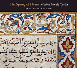
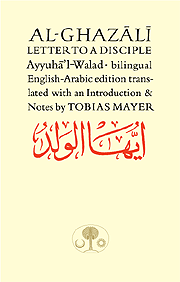
[Left: Samples of Arabic calligraphy and Roman typesetting/lettering mixed on a page. Far left: A CD cover using the image of an original illuminated Andalusian qur’an from Granada. Now in the State Museum in Berlin]
Many calligraphers don’t like typeset arabic because it does undeniably remove the human element but without it, much useful material would not reach the light of day. Also computer typesetting has displaced the commercial calligrapher. When the Daily Jang, the Urdu newspaper printed out of London, went over to typeset Urdu it put over 10o skilled calligraphers out of action who had to find other jobs. I knew some of them in the 1980s. However, typeset Arabic is here to stay and if used discreetly can be quite effective. Thomas Milo, a dutch computer genius with a knowledge of Arabic, who I worked with in the 1990s, analysed exactly how good Turkish naskh was constructed by a calligrapher, and produced ways of typesetting hitherto impossible with linear type technology, carefully imitating the way a calligrapher would construct a line and the many ways letters were joined together. It was called Decotype Naskh and you will find it on many computers now although it sacrifices some of the subtleties of its fine tuning plug-in version called Tameem. If it is used well it is effective and I rarely use any other Arabic type in my work.
There were attempts in the 19th century by the French to create an Andalusi Maghrebi kind of metal typesetting and it may have had some success in North Africa. If you go to : http://tntypography.com/pdfs/tntypography-Aisha-poster_web.pdf
you can read some more about this early font and also a more recent exploration of a newer maghrebi script. This is interesting but highlights the problem of shoe-horning such a diverse personal style into a such a homogeonised thing as a typeface. Turkish naskh was such a conformed style that digitising it was quite straightforward. But every Andalusi /Maghrebi style was different defying any possibility of forcing it into a standardised typeset mould. This is an apt metaphor for how typesetting has imposed something on humanity and probably why I like the free spirited nature of the many Andalusi styles. In other words any aspiring scribe would be free to find his own style, within the parameters of the language and the general aesthetic of the tradition.
My chief point behind all this is that with Andalusi calligraphy there is no excuse not to do it. It is all too easy to write off classical Ottoman calligraphy as too difficult to do well and to leave it to the experts and end up doing nothing yourself. But with Andalusi scripts you can achieve something readable and aesthetic very quickly. We live in a world of expertism, leaving us content to sit on the sofa and let someone else do it whatever it is. I appeal to everyone who might read this to put aside the lap top, get out some paper and start to imitate some of the samples shown here. When you get to the reed pen and some real ink then the chances are you will have caught the bug and you will start to burn the midnight oil, not satisfied till it looks good. Then your computer will look strangely out of place.
You will see above some samples of arabic mixed with Roman type and this can be dynamic and beautiful. Alas in the case of the majority of publications coming out of the third world (and the developed world) the results are too often decidedly ugly. We seem to have a generation of designers now who know nothing of their own traditions and who have abandoned themselves to a kind of cod modernism, photoshopping their designs to death.
I stated previously how these very different language forms are a kind of metaphor for the convergence of alien cultures in these times and it is clear to me that you can blend these different cultures together if it is done beautifully. When cultures clash is when there is no awareness of harmony or beauty, period. But if you take the best of say Indian, African or Arab culture (and in our case calligraphy) and you lay it together skilfully with the best of European culture you get something greater than the sum of the parts. The art is knowing how to mix it. It’s not about integration, as if these forms could mutate into a hybrid, but the art of harmonising forms and ideas recognising their unique inherent qualities. Of course a hybrid might result in time. A long time.


Assalamu alaikum bro. Abdellatif .
I might join this discussion quite late, but I have recently seen you are in progress to make a documentary on this beautiful script.
I understand there are several types of Andalusi scripts , and by analogy I can imagine the script you are presenting here has the same role as the naskh script used in the east for printing books or copying texts . But as you live in Granada you are well aware of one variant which all the world can see in the mighty Alhambra . I have been searching for a couple of years already if the ornamental script used in the alhambra inscription had a specific name or style, but I cound’t find anything on that except some reference (such as the Boogert reserch you are mentioning above) referring to a “Andalusi Thuluth ” as a related someway to the eastern Thuluth script .
I have found something similar used by some moroccan calligrapher (one above the others is prof. Gouline Abderrahim from Casablanca : https://www.youtube.com/watch?v=CZCberbzG30 ). However this quite revised moroccan style is not actually the same as the one used in Andalus.
In few words : do you have some knowledge of sources reference text / research to study for this beatiful script ?
Jazakallah khairan and blessings for your outstanding work.
Adam – italy
To the best of my knowledge the scripts used in Andalus weren’t given names. The Ottomans gave scripts names as all aspects of their Empire was a very organised affair. You refer to the ornamental calligraphy in the Alhambra which has definite influences from eastern thuluth but remember the Alhambra was late in the day as Granada was on its last legs and there must have been an overlap with Ottoman culture. The designers probably just liked what they saw and embodied it in their work. There are also fragments of Granadan silk weaving from that time which also have thuluth influences. Just about every sample of calligraphy we see from Andalus and even later from the Maghreb appears to be unique to the calligrapher so one can only assume it was a freelance art and as long as it was readable it was acceptable with some scripts better than others. It wasn’t so self-conscious as the Ottoman styles which makes it much easier to write. I’m really not connected to academia which sees this art through a different lens to me. I just appreciate things of beauty both in form and content and practicing it is what matters. Once this all gets near museums and university departments it dies. So I’m not much help in giving references. The best thing is to look and collect and ‘gaze’ at what you are drawn to until it becomes part of you. The real beauty for me of the Iberian styles was its spontanaiety and joyfulness which reflected something of the people of that time and their character.
Thank you Sir!
just what i needed!