Of late I have found my mobile computer screens cluttered with pesky skeuomorphic icons all vying for my attention and rather than just referencing an alphabetic list I’m wandering over muliple pages trying to find what I want…and it’s confusing. A few icons are useful but above that few it starts to become like Chinese with its 50,000+ characters. At least with Chinese it is mostly in one colour with a kind of linguistic system to it. With computer icons the eye is fighting to recognise different colours, shapes and also where the hell you dragged it to last time you rearranged the screen. Now when the word
iconic is invoked we have entered another world of the spiritualisation or sanctification of an object. It’s almost like deifying a picture, a photo for instance, or an object like a piece of technology into something greater than what it is and a misuse of the word and an abuse of language. Or maybe it is just a lack of vocabulary I’m not sure, but whenever I hear the word
iconic I wince and avoid it if at all possible. Symbol is maybe a better word choice in my opinion than icon for general use as it doesn’t imply sanctification.

Religious icons were used historically in Eastern Christianity as devotional aids but escaped religious censure as graven images by being two dimensional with a strict limit on bas-relief i.e. how much the design could be raised above the picture surface (very little). Also the subjects of the icons were often Jesus, his mother Mary or the current Emperor of the time. Ordinary people were not allowed to be pictured as icons which would be a pretty hard call for the snap-happy modern human. Not much of a market for cameras in Eastern Christianity.Of course Muslim and Judaic law proscribed the use of human and natural forms completely, their places of worship adorned only with holy script and designs other than those depicting living natural forms. This does put photography, which we all use, into an awkward category. But the defence that it is just a ‘frozen’ reflection, not a created image, lets it off the hook to a degree. My jury is still out on that one as like most things involved with making a copy of a real object, a sound or a moving thing, it creates all kinds of difficulties as it is the mimicing and dilution of an original reality. I’ve discussed this in a previous post,
Flight from the Real. (I think)
So there might well be some unconscious religious impulse in ‘iconising’ images and objects in this post post-modern world. Humans are worshipping creatures by default. I’m fully well aware of this in the idea of a logo, a few of which I have had to create professionally over the years. A logo is an icon of sorts, i.e. an image, but hardly one which is of devotional significance, consciously worshipped. A logo is generally used in a heraldic sense to display a regiment, a team, a business, a club, a college, a cause, a country or a manufacturer. At times it can verge on idolatry but on the whole not – maybe just ardent love. After all, the general public display openly their loyalty to a football team, a techno product, a city, a cause…you name it. A natural statement of loyalty or maybe just choice. But its purpose is not intended for worship. The flag (a logo by another name), the coat of arms, the banner were used all through history by the Europeans, the Japanese, the Chinese, just about everyone and I hardly think they were objects of worship but just a way to be identified and recognised.
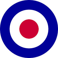
 Interestingly, in arial warfare of the 20th century, pilots would not identify enemy aeroplanes by their country’s insignia as there was never time or sufficient proximity, but by shape alone. Just as well, as the RAF insignia displayed here looks like a target to me awaiting a pot shot. So in the arial warfare example we return to the use of an outline shape, like an alphabetic letter, which is of course much quicker and easier to discern than a coloured icon. It’s called lettering or print! The phonetic alphabets as pioneered by the Phoenicians were a huge advance over cuneiform pictograms, as it enabled an almost infinite way of combining vocal sounds and meanings in graphic form. Phonetic images in other words. It still mystifies me how such hugely developed countries like China, Japan and Korea never abandoned pictograms in favour of alphabets.
So Mr Samsung, Mr. Apple and co., please give me the option of just an alphabetic list, A to Z on my mobile screens like an old fashioned desktop computer instead of multi coloured icons. A Table of Contents! That way I could see everything I needed on one screen and find what I want quickly and alphabetically. It’s a wonderful thing, an alphabet.