In defence of the polymath

When Dr Eric Schmidt, the CEO of Google, berated the English recently for having a too unbalanced educational system I could see his point. But my own very English education looking back was actually very broad and probably accounted for my being more poly than math to be honest as all I remember was doing just about anything I wanted over a seven year period from arts to the sciences and everything in between with no thought of broadening my mind.

Us polymaths, if that is what we are, often get attacked for being jacks of all trades and masters of nothing at all. And actually that is true in many cases. But the classical definition of a polymath includes such dilettantes as Leonardo da Vinci, Aristotle, Goethe and Isaac Newton so we are not all a bunch of dabblers. I generally support the idea of having a broad education and embracing as many skills, arts, crafts, sciences and languages as possible, stopping to specialise only for the  purposes of earning a crust.

This is where my usual plug for Andalusia comes in as if there was ever a bunch of polymaths it was in the glory days of the caliphate around the 10th-12th century, something that Wikipedia conveniently glosses over. Many of the famous names of that time had a multiplicity of unlikely skills compared to the super specialists of this age. Importantly they considered religious scholarship as a key science to have under your belt. These days men are more famous for their advocacy of atheism than knowledge of God what with the Hawkins and the Dawkins of this world. Maybe it was because religious knowledge was the fulcrum of all the knowledges that were emerging at that time. Some have likened the expansion of, and thirst for, knowledge in this period of history and the migration of many to Cordoba, to the assembly of talents on the Californian west coast (including Google of course) in our time, where technical genius, entrepreneurship and design have produced an alchemy which has changed the world culture in a very short space of time. Where geek meets freak in other words. Mind you California has always had this pioneering aspect to it. It’s where the UN was founded and where cultural and economic models (not always good) have set the trend worldwide as if the prevailing winds have blown them across to Europe and Asia.

Take, for example, Abbas Ibn Firnas (810–887 A.D.), also known as Abbas Qasim Ibn Firnas for example. He was an Andalusian polymath: an inventor, engineer, aviator, physician, Arabic poet, and Andalusian musician. Of Berber descent, he was born in Ronda, Spain, and lived in the Emirate of Córdoba. He is best known for an early attempt at aviation. Then there was Ibn Rushd (Averroes) (1126-1198), an Andalusian Arab philosopher, doctor, physician,jurist, lawyer, astronomer, mathematician and theologian. And of course Ziryab, the famous poet, musician, singer, cosmetologist, fashion designer, trendsetter, gourmet, strategist, astronomer, botanist and geographer. I could go on. This kind of agglomeration of talents was the norm in that society. Eric Schmidt hit an uncomfortable nerve. Good for him. The next time you think only a specialist or an expert is qualified to do something then think again.

A full transcript of Dr Schmidt’s speech can be seen here:

http://paidcontent.co.uk/article/419-watch-live-here-eric-schmidts-edinburgh-keynote-and-twitter-reaction/

Posted in miscellaneous | 2 Comments

Reviving Andalusi script part 2

The Style
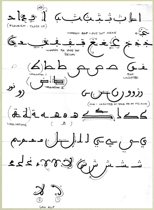
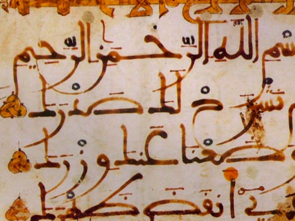
The initial impression of ancient Andalusi scripts is of something beautiful and dynamic, executed quickly and accurately but also with a free spirit, each calligrapher creating their own unique ligatures and flourishes, though still somehow within the compass of the style. The colour of the ink varied from black though to brown, possibly from burnt sesame with a natural variation caused by the ink’s varying density. Those familiar with common arabic would need to get used to certain differences like the fa being dotted below the letter and the qaf being dotted above the letter. But also the many variants of the tarmabuta and the curious stress with which many letters like the alif begin with and the curl of the basic ba form at the beginning of a word. Close study unveils all these little secrets.

[Above: A page of simple Andalusi letter forms by the author using a felt tip pen on ordinary paper used as a teaching aid]

For anyone wanting to unravel all the different Andalusi letter variations I can recommend (url below) a useful essay from a Dutch researcher named Boogert who analysed some Andalusi scripts. His work helps to unknot some, but not all, of the more obscure letter configurations:
http://www.islamicmanuscripts.info/reference/articles/boogert_notes_maghribi_script.PDFI I think this document was designed for researchers and translators trying to decipher old manuscripts rather than an aide for calligraphers but I have found it very useful all the same.

Materials
Without doubt cane reeds would have been used though exactly what these were like we can only guess at. Some suggest the calligraphers of that pre-reconquista period in Spain wrote with a flat reed with a stub end rather like a felt tip. Not like the relatively sophisticated pens used by the Ottomans with their clear angle-cut reed tips. My guess is that most calligraphers had their own personal and secret methods for making pens as they also did for making paper and ink. Anyone interested can experiment themselves, it really isn’t that difficult and is an insurance against the day that you are not able to buy these things in the local store. Although the variegated brown ink style is very attractive, I prefer the black ink made from soot recipes just because it is clearer and more easily available. But you are the best judge.

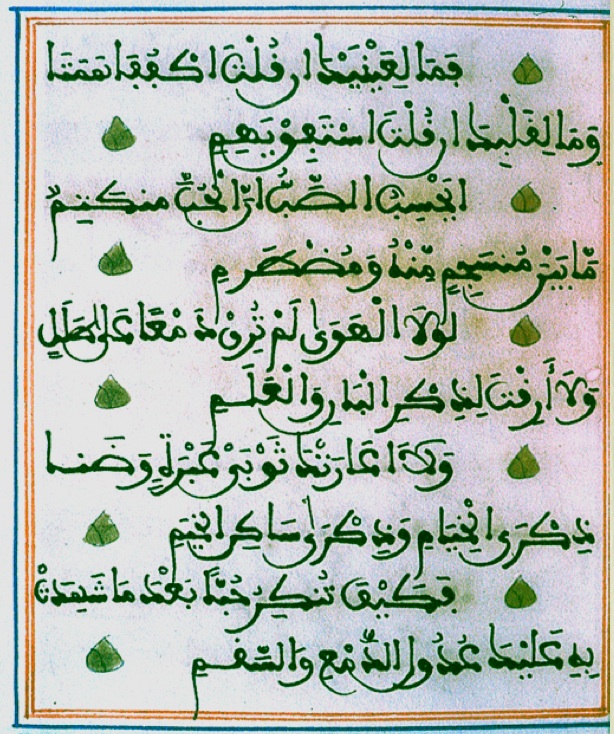
A lot of trial and error and imitation is necessary for the beginner. Although it is possible to buy calligraphic ink, pens and paper the best ink and pen will always be what you make yourself. Coloured inks were often used in fancy Andalusi qur’anic manuscripts for the harakat (the diacritic marks) as in the sample below.
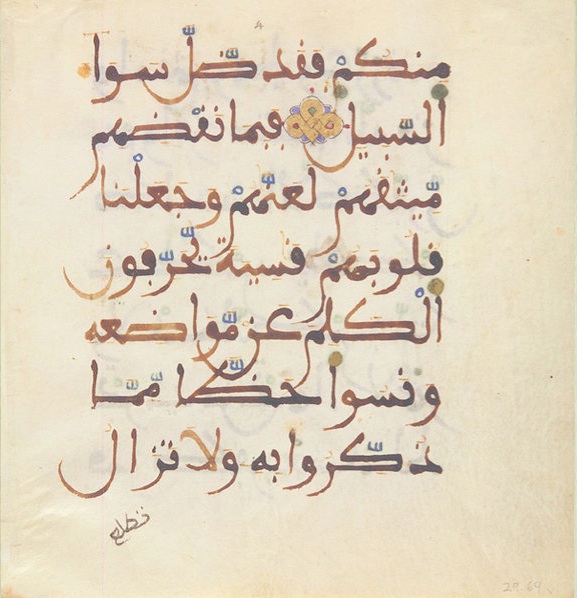
Making paper from scratch is not that difficult, but it is simpler to buy good quality cartridge and then treat it, dye it with tea, and burnish it before writing on it with an agate polisher. It’s worth borrowing some of the Ottoman methods to achieve this. These recipes can be found on the internet (eg zakariya.net http://calligraphy and qalam.com/index.html) and involve anything from egg white, starch, alum and gum arabic. What we are aiming at is a style of calligraphy, not a tradition for traditions sake and we should feel free to borrow any process which enhances and enriches the work. I’ve found that the more you put into preparation of the materials and prepare yourself mentally and spiritually, the better the result. The end result will reflect the love and care that has gone into all the stages of its production. The moment in time when it was made is captured for eternity. The Jewish rabbis of old had to make a complete immersion bath before they were allowed to write the Torah. Maybe we could benefit from this kind of fastidiousness.

It is a reminder of how modern man takes for granted the whole process of pens, ink and paper and how the whole experience of writing has been dumbed down until we scribble in felt tip pens on cheap copy paper. (what I am forced regrettably to do quite often) And ultimately abandon writing altogether for the keyboard. Arabic calligraphy (any calligraphy in fact) to me is like the electro-cardiogram of the human heart, expressing perfectly the spiritual condition of the calligrapher. By practice and repetition you see clearly before you your inward condition.

The calligraphers of old always taught their students to divide their time equally between collecting samples of calligraphy and studying them closely, (‘gazing’ is the word they used) and the act of writing. When I have given classes in this kind of calligraphy I have seen pretty miraculous results with quite unartistic people producing in a few hours very good copies of a page of an ancient manuscript. Something impossible with the Ottoman styles which require many years of training to get even mediocre results.
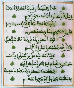
[A 19th century illuminated Burda from Morocco]
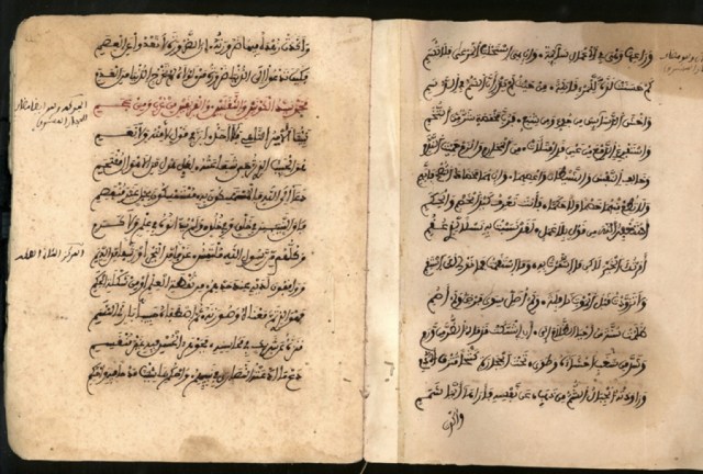
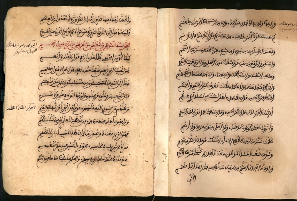
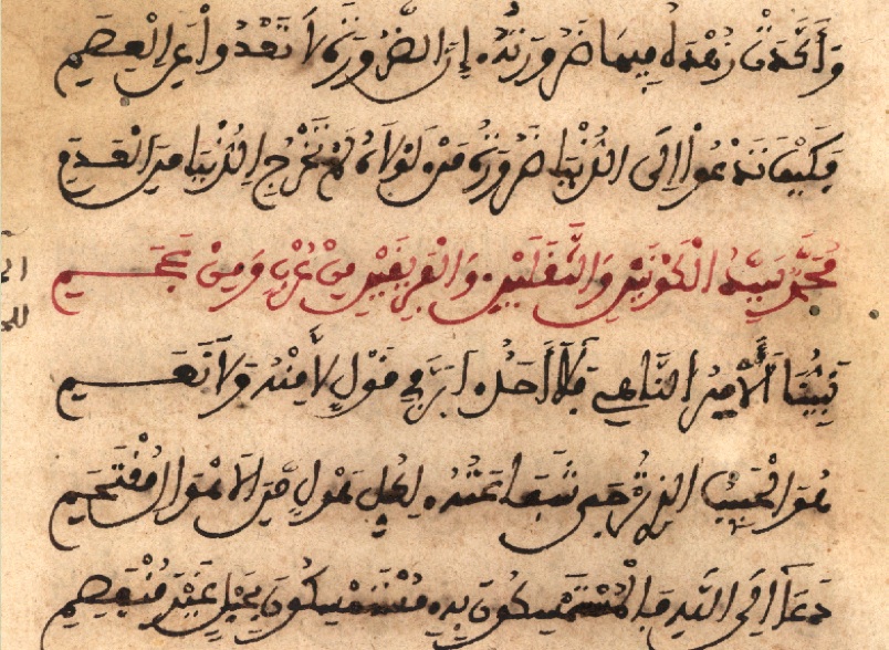
[ A hand copied Burda for personal use. Fes, 19th century. As printing didn’t exist then, to own such a text necessitated copying by hand if you were able to. A beautiful individual script on poor quality worm eaten paper, written with love and care.]
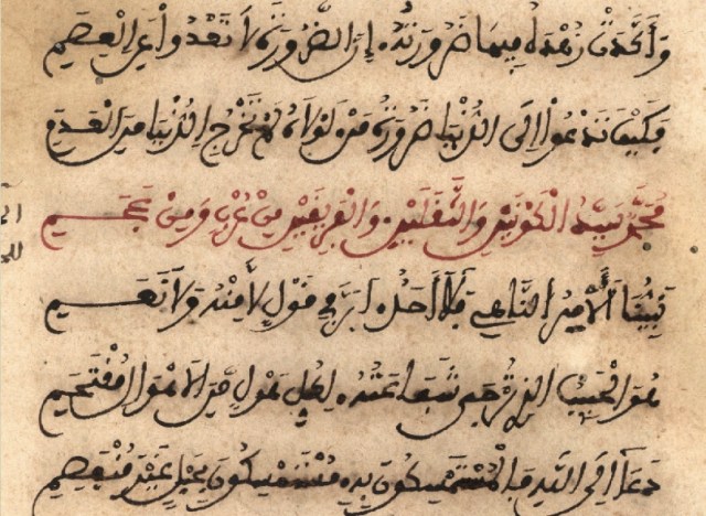
[close up]
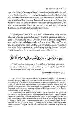

[Above: a page of typesetting incorporating typeset arabic]

Typesetting. Its pitfalls and uses.
This is a huge subject but I’ll try and distill the key points. Roman (ie English, French etc.,) typesetting was based on hand drawn letter forms and although printing began with Gutenberg in Mainz, Germany in 1440, the best early typefaces came out of Italy, France and Britain. (Bembo, Jenson, Baskerville) Printing didn’t really come to Arabic till much much later partly because of its hand scripted nature and making moveable metal type a practical reality didn’t arrive till the beginning of the 20th century in Egypt. The different versions of each letter depended on its position in the word added to the character set making setting much more complicated. But also there were objections from Turkish religious scholars that the quite violent act of the printing press was unbefitting the pure nature of arabic sacred texts.
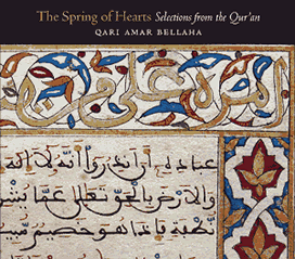
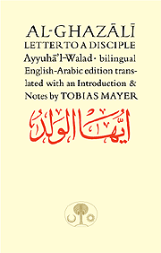
[Left: Samples of Arabic calligraphy and Roman typesetting/lettering mixed on a page. Far left: A CD cover using the image of an original illuminated Andalusian qur’an from Granada. Now in the State Museum in Berlin]

Many calligraphers don’t like typeset arabic because it does undeniably remove the human element but without it, much useful material would not reach the light of day. Also computer typesetting has displaced the commercial calligrapher. When the Daily Jang, the Urdu newspaper printed out of London, went over to typeset Urdu it put over 10o skilled calligraphers out of action who had to find other jobs. I knew some of them in the 1980s. However, typeset Arabic is here to stay and if used discreetly can be quite effective. Thomas Milo, a dutch computer genius with a knowledge of Arabic, who I worked with in the 1990s,  analysed exactly how good Turkish naskh was constructed by a calligrapher, and produced ways of typesetting hitherto impossible with linear type technology, carefully imitating the way a calligrapher would construct a line and the many ways letters were joined together. It was called Decotype Naskh and you will find it on many computers now although it sacrifices some of the subtleties of its fine tuning plug-in version called Tameem. If it is used well it is effective and I rarely use any other Arabic type in my work.

There were attempts in the 19th century by the French to create an Andalusi Maghrebi kind of metal typesetting and it may have had some success in North Africa. If you go to : http://tntypography.com/pdfs/tntypography-Aisha-poster_web.pdf
you can read some more about this early font and also a more recent exploration of a newer maghrebi script. This is interesting but highlights the problem of shoe-horning such a diverse personal style into a such a homogeonised thing as a typeface. Turkish naskh was such a conformed style that digitising it was quite straightforward. But every Andalusi /Maghrebi style was different defying any possibility of forcing it into a standardised typeset mould. This is an apt metaphor for how typesetting has imposed something on humanity and probably why I like the free spirited nature of the many Andalusi styles. In other words any aspiring scribe would be free to find his own style, within the parameters of the language and the general aesthetic of the tradition.

My chief point behind all this is that with Andalusi calligraphy there is no excuse not to do it. It is all too easy to write off classical Ottoman calligraphy as too difficult to do well and to leave it to the experts and end up doing nothing yourself. But with Andalusi scripts you can achieve something readable and aesthetic very quickly. We live in a world of expertism, leaving us content to sit on the sofa and let someone else do it whatever it is. I appeal to everyone who might read this to put aside the lap top, get out some paper and start to imitate some of the samples shown here. When you get to the reed pen and some real ink then the chances are you will have caught the bug and you will start to burn the midnight oil, not satisfied till it looks good. Then your computer will look strangely out of place.

You will see above some samples of arabic mixed with Roman type and this can be dynamic and beautiful. Alas in the case of the majority of publications coming out of the third world (and the developed world) the results are too often decidedly ugly. We seem to have a generation of designers now who know nothing of their own traditions and who have abandoned themselves to a kind of cod modernism, photoshopping their designs to death.

I stated previously how these very different language forms are a kind of metaphor for the convergence of alien cultures in these times and it is clear to me that you can blend these different cultures together if it is done beautifully. When cultures clash is when there is no awareness of harmony or beauty, period. But if you take the best of say Indian, African or Arab culture (and in our case calligraphy) and you lay it together skilfully with the best of European culture you get something greater than the sum of the parts. The art is knowing how to mix it. It’s not about integration, as if these forms could mutate into a hybrid, but the art of harmonising forms and ideas recognising their unique inherent qualities. Of course a hybrid might result in time. A long time.


Posted in typography / design | 4 Comments

Reviving Andalusi calligraphy part 1

For most people, calligraphy and especially arabic calligraphy is an arcane subject but it’s been a life long involvement for me and I want to introduce some of my own observations on this blog which as far as I can tell aren’t discussed anywhere in the mainstream and which are unabashedly not academic and which I hope will be of interest.

In an age when people rarely touch a pen or pencil and when especially young people are more deft at text input to their smart phones than they are at handwriting, it is suddenly a matter of urgency that handwriting and calligraphy (i.e excellent handwriting) in every language are restored to peoples lives. There are secrets to handwriting which need to be revived and taught to our children before their fingers atrophy and fall off. But I have no idea how you accomplish that, short of making it a compulsory school subject which of course for generations it always was, up to quite a high school age. When students of this time suddenly experience creating beautiful written forms, a universe of delight opens. Arabic calligraphy is artistically and culturally elevating the activity of writing up to another level from English (i.e. Roman) calligraphy. It doesn’t actually require a knowledge of the language to be able to copy the letter forms but it does help and people from Western lands tend to be drawn into it for religious reasons usually as for people learning qur’an etc., you really need to know the written language.

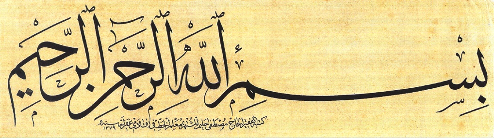
(A non-linear Basmallah in Thuluth script – probably 19th century Turkish)

My interest in arabic calligraphy goes back over three decades to when I first visited Mohamed Zakariya, the well known master calligrapher from Washington DC. In a short meeting with him he ignited my interest enough to take it seriously.  He is primarily a master of the Ottoman styles which include Naskh, Thuluth, Muhaqaq, Nastaliq etc (see the link to his web site on the side bar of this blog) though he ventures occasionally into more obscure styles like kufic and Andalusi Maghrebi. It’s the last of these styles I want to focus on as it is, aside from its beauty, among the world’s threatened indigenous calligraphic styles. Rather like rare languages which are threatened with extinction every day, indigenous calligraphic styles have been over the last few centuries eclipsed by cultural globalisation and mass media.

Evidence suggests that when the Ottoman Empire collapsed, the media centre of gravity of the Arabic speaking world shifted to Egypt which had become one of the first Arab countries to employ printing presses. In fact they led the way with book and newspaper printing, audio recording, radio, film making and because of this became very influential right across the Muslim world. The first text faces in arabic were naturally modelled on naskh, the preferred script of the Ottomans, as it was very readable but also one of the most difficult to write well. It must have had an enormous impact in far flung countries like Algeria, Morocco, Senegal and Nigeria which had their own scripts which had developed over centuries from the very first days of the Muslim empire.

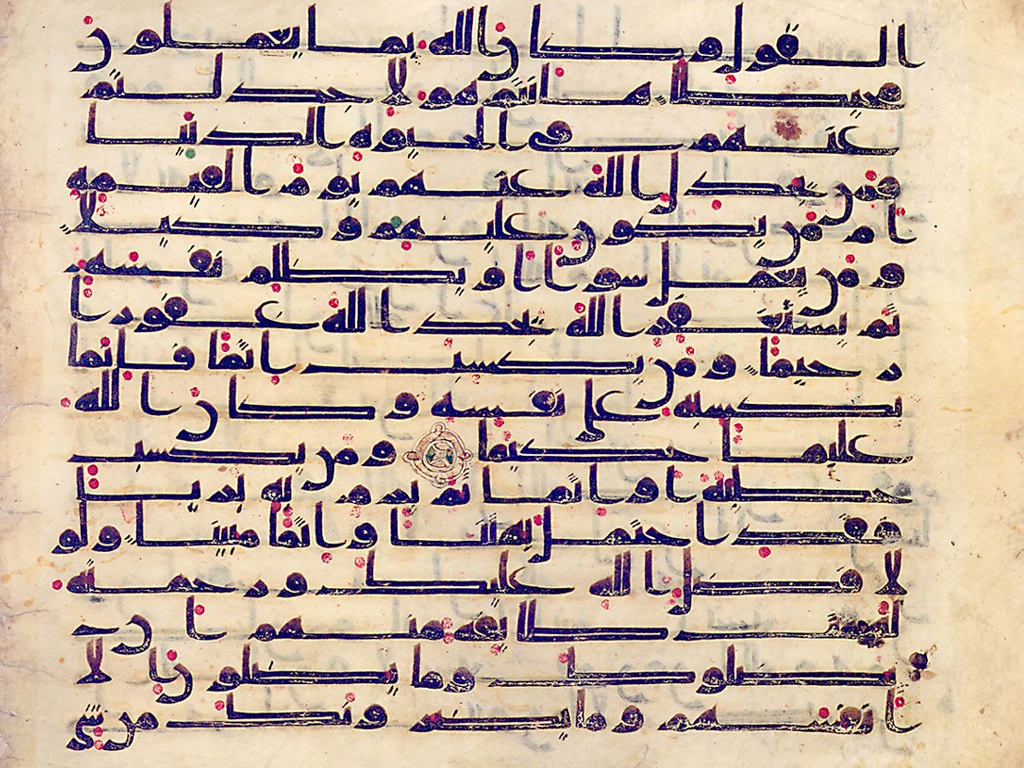
My own fascination with Andalusi script is for several reasons. Firstly that I live in Andalusia and that I like to feel that I’m writing in a language and a script that was dangerous enough to have been banned by the Inquisition so many centuries ago. Aside from that the script itself has deep secrets. If you analyse the form of the script the first thing you notice is its linear nature revealing its ancestry in the kufic scripts of the Arabian peninsular.

(Qur’anic Andalusi script , circa 12th century Spain)

If you compare this with the basmallah at the head of this article the andalusi script is quite different from the Ottoman styles which have left the line and fall in elegant cadences with each word. This linear nature reveals its antiquity as it has descended directly from the early monumental kufic scripts which evolved in the first hundred years after the revelation.

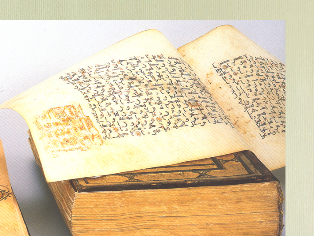
As Islamic culture spread across North Africa the scripts became less formal and the nun for example which hitherto had been vertical like the Hebrew nun started to change and curve into the nun form now written universally in modern arabic.  (below: a page of kufic arabic on vellum. Note that the scribe had no inhibitions about hyphenating words, something strictly avoided in later times)


A page from a Qur’an from Palermo in the Khalili collection (above) illustrates this transition 0f monumental arabic into a more practical and faster and speedier script. Mohamed Zakariya claims that there was always a cursive kind of quick script but only the important documents on vellum have survived.

So what happened in 1492 was that this line of history was cut off when the agents of Ferdinand and Isabella burnt all the books written in arabic in great bonfires in the streets of Granada, the last great muslim city to fall. The few books that escaped show what treasures they must have destroyed and which for this reason are immensely valuable. Another reason I enjoy this form of arabic is that is easy to write and is not subject to the strict rules of Ottoman calligraphy which came later.  Some calligraphers obviously excelled more than others but the styles were very individual rather in the fashion of different handwriting styles in our time. It didn’t aspire to a high art but was practical and beautiful nonetheless. Remember the culture of Andalusia and Morocco was very different from the structured government and bureaucracy of Istanbul and its far flung empire. People in early Muslim Spain wanted writing as a means to an end such was the thirst for knowledge. What was needed was a quick means of recording and transmitting all kinds of information, translations of Greek and Latin texts, books on science, mathematics medicine, law etc. It is reputed that Cordoba in its early days was home to 700 calligraphers working full time copying manuscripts. Most of them women apparently. No printing meant plenty of jobs for scribes.

I must make it clear that I am the greatest admirer of the Ottoman scripts and I have only ever seen the differences with earlier forms as complementary – expressions of beauty in different periods of history. But in defence of the underdog I revert to the Andalusi style because I think this is a script that many could learn well without having the exacting training and gifts to practice the Ottoman styles (which i do know but find incredibly difficult).

I’ll develop this further in a future post to discuss practical ways of reviving the Andalusi styles and some useful reference material you can download. Also how arabic and roman scripts can be blended to beautiful effect. How this convergence of scripts is a metaphor for the kind of cultural convergence taking place in societies everywhere. And whether computer typesetting ( English and Arabic) has any artistic merit.

Posted in typography / design | 3 Comments

Acequias

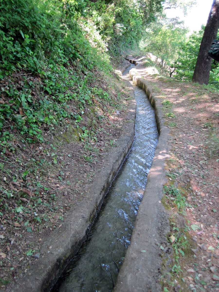
Acequia is the Spanish and Arabic word that describes the ancient system of irrigation that, in Andalusia and other parts of Spain, is still the lifeline of small scale agriculture. Much is written of the great old muslim cities of Sevilla, Cordoba and Granada but these are famous of course for their buildings which are just monuments for tourists to gawp at. And beautiful places they are indeed but dead in many ways as well – just relics of a lost world. The acequias, on the other hand, are for me, a living and quite miraculous vestige of a civilisation which was overwhelmed by the greed of the reconquistadors who led Spain into five centuries of darkness, tyranny, injustice and famine. Culminating of course in the Spanish Civil war which ended in 1939.


Most ascequias are private associations which levy a very reasonable fee for a year’s rights to water….and a lot of it too. I speak here from practical experience having used and benefited from them for the last five years. Your land, if it has water rights, is flooded with water at a fixed time in the month or week or else when the neighbour has finished and your time comes. It varies with every association but the farmers jealously guard this life giving resource. Early on when I didn’t fully understand the system I once had an irate farmer jumping up and down waving his arms around in protest at my having taken his time for the water.

The first time my land was flooded with acequia water it was night time and for an hour or so I was wandering around up to my knees in water and mud trying divert it where it was needed with just a torch and a shovel. It was exciting, mysterious and primordial, something which many must have experienced down the centuries. Just you and all this water. Although for much of the year it is very dry here, you learn to respect water as when it does come (like the winter rains) it sweeps everything before it as it comes down the mountain. The most powerful of the natural elements that we daily deal with and so essential to our lives.

The summers are scorching hot here in the Alpujarras – a region which lies in a large valley to the south of the great Sierra Nevada mountain range that is to the south of Granada and which you see in the distance towering behind the famed Alhambra Palace in that city. But despite the heat, the acequia water can flood a field or terrace very quickly with enough water to keep the ground wet enough till the next allotted time, whenever that is, sometimes 10 days or two weeks later. The water itself comes from a variety of sources, mostly river water from the high Sierras but also from wells when the rivers dry up in mid summer. For anyone who grows crops, vegetables or fruit trees or who even just maintains a garden of any sort it is the great giver of life. The acequias also feed the wild flora and fauna of the valleys as the old water courses invariably leak. Without this it would be an arid landscape. Most of the old water courses that I know have been in use for over 500 years and very likely go back much further and are an engineering marvel considering how hostile the area must have been to the first inhabitants up here. I for one would love to know more about them and I’m pretty sure there are detailed histories in Spanish libraries if only my Spanish was better. They really are a living miracle and one of the very tangible legacies of the Moorish presence here not forgetting of course the orange, lemon, grapefruit and pomegranate trees, rice, jasmin, cherries, apricots, saffron and, and, and…

Posted in miscellaneous | Tagged , , , | Leave a comment

Smoke Signals

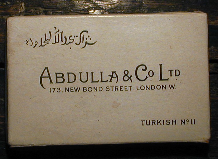
I discovered the other day, as one does, a web site called http://www.cybergrot who are/were selling an old used box of Abdullah cigarettes. It was empty except strangely, for one remaining cigarette. Really quite a work of art. I find this interesting as when I was a student in London in the early 1960s I used to buy these oval section cigarettes as a kind of indulgence although I wasn’t really a smoker. Odd, as I could barely afford food let alone smokes.

In the modern western world, where even public spaces are being sterilised of smokers, it has all got out of hand. Ironically, the tobacco companies, who have done their best to get the whole population addicted to tobacco, are themselves responsible for destroying the market and virtual prohibition, as it was they who made it no longer an aesthetic and beneficial enjoyment for the populace but a chemical addiction from which BAT and Phillip Morris et alia made fortunes for their shareholders. By the addition of chemicals to preserve the tobacco and to help it burn better they created tasteless and poisonous sticks of nicotine. I’m not a smoker but I do think people have a right to smoke if they want to, but not from addiction. These older Turkish cigarettes were very powerful and I remember a few puffs and you would almost pass out from the effect or worse, turn green and throw up. It kept one from ever becoming addicted – an effective aversion therapy .

I’ve introduced this subject into my blog as I have many friends who are either Turkish or connected to Turkey for whom smoking is almost a religious sacrament. These are often connected to the sufi orders of that country and also of Bosnia, and I imagine all the rest of the post-Ottoman Balkans. It was the Ottomans who must have introduced smoking into the west as a socially acceptable habit and it prompts me to look into it as it was always accepted in Britain that Francis Drake, the sailor, introduced it from the Americas. There must be extensive histories on this subject. I’ve attended some of the meetings the local Jerrahi sufis hold in my neck of the woods here in Andalusia and their visiting Turkish and American teachers, to a man, usually chain smoke through their hours of shorbets (discourses). And often it’s from a packet of Marlboros, not exotic (illegal) organic Turkish tobacco which they do use on occasion. Personally I find it really choking and unpleasant if the smoking is indoors let alone the smell it leaves on your clothes. But I do believe that it does activate something in the brain of the smoker which is of some benefit. Others have told me the same. In a way it’s all got out of hand and the baby has been thrown out with the bath water. Most of the muslim scholars as well as the medical profession pronounce against tobacco and I’m with them because of what I say above, but it is not a black and white issue. It’s just that the art of smoking has been lost. Intelligent people should be able to make up their own minds on these things. Unfortunately the modern chemicalised cigarette and its relentless promotion (now increasing in the undeveloped world) has spoiled it for everyone.

Posted in typography / design | 2 Comments

Two new books

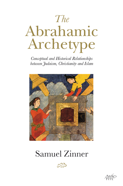
A couple of quite different books just completed. The Abrahamic Archetype was commissioned by Archetype publishers in London for whom I have worked for many years. Archetype appreciate nice typesetting and have an experienced eye for detail. Baskerville is a typeface which never fails either as a display face or for text. In this case Baskerville was used on the cover and my own edited pro font of Bembo for the inner pages.

The second book was designed for Awakening in Swansea and is by Professor Tariq Ramadan. Hard not fall into clichés with emotive words like Jihad and Violence in the title. I dodged the obvious and ended up with an image of what happens after war and violence has left its mark. This image is of a wall in Berlin with bullet marks from the last war. If you walk round Berlin you will still see such traces of the last world war on bridges and walls. As there were so many words in the title it was straightforward to make a feature of it with a classic Roman typeface. I was quite pleased with this having almost given up trying to find a solution. It’s suitably sober but a nice image nonetheless.


Posted in typography / design | 1 Comment

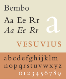
Bembo, a short history

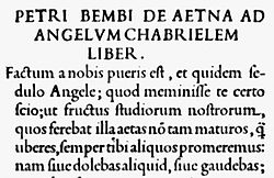
Anyone who is familiar with typefaces (it’s my job) will know the name Bembo. It is probably the most elegant of book text faces that I use and only aficionados will know of its curious provenance. Although Bembo looks as fresh as a daisy and is quite at home in a newly printed book it is in fact over 500 years old. It comes from the time of Aldus Manutius, a powerful renaissance scholar, printer and publisher in Venice who employed a genius punch cutter named Francesco Griffo who in turn was responsible for creating a new alphabet of moveable type designed specially for an essay written by the literary scholar Cardinal Bembo which Aldus Manutius was publishing. He based it on pure Roman forms and also introduced for the first time an italic form based on a cursive handwritten style. The essay became very popular but it was the typeface which became much more famous, in use right up to the present day. Unfortunately Griffo, the creator of this typeface, had an unfortunate end and was arrested and finally executed for killing his son-in-law with an iron bar.

Most users of type are largely unaware of where they originated and how the best of these text faces are more than 500 years old (Jenson, Baskerville, Garamond etc) and that even so called modern faces like Rockwell and the famous London Transport typeface of Stanley Morrison and even Cooper Bold, the Easyjet typeface all date from very early in the last century. Also that they were initially hand drawn and later picked up by the font foundries. I’d like to deal with this in another post in which I can explore the origins of writing and lettering in both roman and arabic scripts –  rather a large subject. Understanding the sources of our civilisation is one way to help cure some its ills and a place to find new inspiration.

Read more about Aldus Manutius and Bembo at www.http://www.thebookdesigner.com/2010/10/typefaces-as-history-aldus-manutius-and-the-noble-bembo/

Posted in typography / design | Leave a comment

Grassed Off

The Wimbledon mens final last Sunday, which was won by Serb tennis player Djokovic was remarkable for me not because of the tennis, but because Djokovic ate grass from the court he had just played on. A Wimbledon first for sure. It was curious for me because in 1997 I had to go to Stuttgart to meet a Bosnian pop star named Dino Merlin to record some tracks for an album I was producing called I Have No Cannons That Roar for Cat Stevens aka Yusuf Islam which included music recorded during the Bosnian war, which had just finished two years before. In the studio was a collection of Bosnian musicians who were working with Dino at the time. One I remember told me that during the war he lived on grass for three months while having to walk three kilometres every day to the front lines where he dug trenches. I sensed the Serb winner of Wimbledon was not as popular as previous winners and whether it was his strange behaviour of beating the ground with his racket in rage having lost a point or his grass munching antics I’m not sure. Or was it the fact that the world has not quite got over that appalling war. I had to remind myself that Milosovic and his evil cronies erected totally false identities in order to prosecute their war in what was once one country. Namely a Serb national identity (not Orthodox Christian) versus a Muslim religious identity. It was only a small step from the tennis court to the war crimes court where at the same time another Serb, ex-general Mladic, was on pugnacious form and was removed from the court for his bad behaviour but not presumably for grass munching. I met a lot of Bosnians in my two visits to Sarajevo in 1997 who to a man and woman said that the religious identity was put on them from the outside and that true Bosniaks included Muslims, Christians, secularists, Serbs and Croatians under one banner. It was this pluralist culture which had survived intact for 600 years which the Serb fanatics wanted to destroy – and failed. In the enormous graveyard in Sarajevo which was its main park up to the war you will see the occasional Serb and Croatian grave. All who fought and died for their country: Bosnia.

Posted in miscellaneous | Leave a comment

Giving it away for free?

I noticed over the weekend that Brian Eno has released a new 2 CD set of music with recited/sung poetry. It covers many different media being available as a free digital download, a double vinyl album. a double CD set and a book which I assume you have to buy. It’s intriguing for me as it makes the assumption that people will buy an experience and that getting something for free isn’t all it’s made out to be. Many years ago Brian Eno predicted that the only future for selling music would be as a total experience not just the tunes. So he’s true to his word. Anyone who has a vast library of mp3s stuffed into their Ipod will probably have at some time or other felt how impersonal and decontextualised they all are. How different from books stored on my bookshelves with personal dedications from the authors (mostly books etc that I have worked on). The same debate is going on as we speak between the ebook and the printed book. For most people who pirate mp3s off the web they will use an economic argument and I’m with them even though I have a few music albums up there in the cloud for which I will get no royalties. I find these musicians and their record companies are really graspingly stingy wanting to scrape every last penny they believe they are due. The recording companies and their political stooges trying to shut down net piracy know they are on a losing wicket as there will always be a way round their subterfuge..

Which is why Brian Eno’s strategy seems so intelligent and why I would like to do the same with material I have. The Complete Dip in the Ocean (mentioned on an earlier blog) I would like to make available but I need to sell the mp3/CD at a modest price just to facilitate it. I might even resort to burning CDs and packaging them myself as I used to years ago and selling direct to the public but that is very labour intensive. At least that way you get know who is buying what you sell. Self publishing books is rather similar.

Posted in music | Leave a comment

The dreaded logo

The most difficult design assignment I’ll ever get is to design a logo or logotype. These can often be so baffling and can cause me to wake up in a sweat in the night as my sub-conscious runs interminably through possibility after possibility. Such a design can happen quickly or take weeks or months which is why in the last few years I have cranked up the price for designing them. Imagine if Van Gogh had to paint a masterpiece with the client commenting at every turn – I don’t like that tree or that sun you’ve painted looks too wobbly. He would have lost his mind a lot earlier than he did and probably lopped off the other ear.

But clients come in all shapes and sizes and I have learnt over the years not to discount clients’ ideas and not about just logos. It’s often an alchemy between your own ideas and the seemingly impossible ideas a client might have. The good design (logos included) is always something beyond what you initially envisioned.  But it’s in the realm of typography that I feel like pulling rank sometimes although I have never actually said yet “you know nothing about typography or typefaces do you?” I’ve certainly been tempted. In fact as everyone knows the way you craft an email can be the difference between getting or losing a client. Who hasn’t laid  in bed regretting the email that  just got sent in a fit of pique. Of course the English language allows for one to express all kinds of subtleties which I just don’t think eg Spanish, allows for, so one can infer, suggest, imply and prevaricate in all manner of ways to avoid outright hostility. The golden rule is never send an email in anger and if you have to express something difficult, write it then wait till the morning before sending it. A lot happens with a night of sleep. It’s real art as it’s all so quick…no heaps of screwed up letters in the wastepaper basket.

Posted in typography / design | Leave a comment