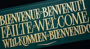
Much as I have championed skilful type design I am also saddened that the type font has virtually wiped out the sign writer’s craft. Hand lettering on shops, vans and on sign posts and name plates has all but disappeared in the west and only in a few places does it persist. I’m not talking just about the professional sign writer who may still get the odd art job here and there and who will be identified by the ball and stick he wields to guide his hand as he deftly applies paint and gold leaf while up a ladder in a busy street – but also I mean the homemade variety of lettering you would see on a butchers’ shop window done in a traditional style with some easily removable white paint – “chump chops today £2 only”. In the ever encroaching standardised branded shop sign conceived in some ad agency, the hand-executed sign nonetheless sticks out a mile. Because it is unique and individual and sticks in your mind.
 I always recall from the 1960s, seeing on a butchers shop window in Camden Town, London on the 24 bus route as I passed by everyday, hand-blazoned on the glass with white paint: The Eat Meat for Heat Meat Boutique. The wording would change weekly as the owner poetically came up with another pithy phrase. It was his little blog for the passing population to wonder at. At top down corporate level this could never happen – of course.
Sign writers do still exist but often do commercial vinyl cut or silk screen typeset signs as well, though the purists would never venture into such technology. When you see handsome freshly made gold- leafed lettering the eye is drawn to it as it reflects light in unusual ways especially on black or dark green. And you momentarily look into the artistic soul of the artist. It is an art form which I admire which makes the plasticized variety look very bland. Not that there is no art in the ad agency brand. It just lacks soul.
I’ve done a few shop signs in my time, The Poor Mans Trading Company in Bristol Gardens, Maida Vale, London back in the 1970s….(no pictures, sorry). And The Strangers Wool Shop in Norwich in the late 1970s and a whole raft of section signs for the actor Michael Gough’s antiquarian bookshop in Holt, Norfolk in that period when one did whatever job came through the door. I had to just invent the rules as I went along but a knowledge of roman lettering really helped. The work I did wasn’t that good, as I was aiming high and fell short, but nonetheless it possessed a uniqueness that regular type would not possess no matter how well machine executed.
If you wander around the Cambridge Colleges you will see beautifully small hand lettered name plates in white on black, black on white or even gold on black–on the doors of some professors and also on the sign boards of the more exclusive shops. Down here in Spain you will still see artful hand painted letters on many a white wall advertising a car workshop or a restaurant. In Granada, Spain (my local city) you can still see pre-technological original sign art from 50-100 years ago. On the many family owned businesses (no Starbucks yet) you will see echoes of the old, probably Franco period, of commercial signs. But the mark of the corporation jackboot I’m afraid increases yearly with Zara, H&M, and Apple who have arrived in the last few years in this beautiful old city…oh and Dunkin Donuts which has looked very out of place and unpatronised since it opened. The Spanish prefer churros, did no-one tell them …!
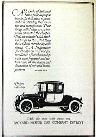
I have a remarkable book about the designer and American artist Oswald Cooper who hailed from Chicago at the beginning of the last century. His way of producing a newspaper ad or some promotional literature was to letter it by hand and where needed draw the product as well (see illustrations below). He was so good that the metal type houses bought his letter designs, one which became a famous typeface to this day: Cooper Bold, which you all know. Easyjet; the credits of Dads Army and so on.
Oswald Cooper
Cooper Bold is a strangely timeless typeface, easily recognisable at any size and slightly comic and chubby but very readable. Part of the great lexicon of western typestyles. He was a commercial artist which was common-speak in those days for a non-artist, an attitude which was prevalent until the 1960s when they (we) became graphic designers. It was a reminder that everything we see printed or projected on our screens was once hand created. The best art for me is something that is unique, un-copied, un-reproduced, a record of the unique moment in time it was created and painted. This is the humanity you see in the hand painted signs that, in the developed corporate world, are getting rare. Go to India or many parts of the third world you will still see that colourful blast of life.


This is great, so interesting. The point about hand lettering is especially intriguing (I for one have lost the skill of handwriting). I also really like the photo of the bus with the Hindi lettering.
Here are some examples of hand-painted signs from Bangladesh:
http://www.ghostsigns.co.uk/2012/02/hand-painted-bangladesh-2.html
PS. What’s the name of the Oswald Cooper book?
The Book of Oz Cooper
(an Appreciation of Oswald Bruce Cooper)
The Society of Typographic Arts, Chicago 1949. Hard back.
Ouch, that’s expensive, one to get at the library I think. PPS. Forgot to mention my book about Cambodian signwriting: http://kratie.ghostsigns.co.uk