A Brief History of Transliteration

Language is powerful; and its written word is like a weapon which when launched out into the world enlivens or maims. As cultures and civilisations have moved and evolved through history, the way they have chosen to write their language speaks volumes about their deep motives and aspirations. And of course as one civilisation morphed into another it had to borrow the old words but rewrite them in its new way. This has been going on since writing first began around 5000BC. This is a mighty subject and I can only hope to throw a few personal observations into this post. It is something which affects all of us profoundly, but imperceptibly so.

I want to start from the present and work backwards as this is the only way you will grasp this rather arcane subject. About 23 years ago I was working with the Islamic Text Society in Cambridge UK trying to design books in a computer, a task which hitherto had not been attempted as the criteria for book design were much more demanding than say your average newsletter or magazine, the most a business oriented PC of the time was capable of. One of the priorities was adapting a roman font, Bembo in this case, to accommodate all the different conditions that translated arabic demands and creating the vowels and consonants that don’t appear in the standard roman alphabet. Publishers and writers, mostly academics and translators, have come up historically with various systems of transliteration which typographically were inadequate, like the font Middle East Times, which some might remember from the early 1990s, loved by some academics, which automatically placed a thick line (a macron) above the letter a to correspond to a long aa in arabic. The problem is that you were stuck with the one typeface and it didn’t respect the fact that each letter with a diacritic mark has to be balanced, proportionate and readable at all sizes. Which is why editing a font with these marks is a lengthy process as each character has to be designed carefully and individually … you can’t average it out for all conditions. In other words each diacritic glyph has to be an individual work of art and importantly readable small or large.

Adapting arabic (or any hand-scripted foreign language come to that) into roman type (i.e. English, French etc,) is a recent development but reflects the convergence of cultures in this time, namely the adaptation of arabic words into roman type prompted initially by translations of the Qur’an and the general interest in Islam in the west. The earliest printed Qur’ans in English, e.g. the George Sale 1850 edition (of which I have an original copy here) did their best using marks common in the printer’s palate… eg the long aa would utilise the circumflex mark â and a long uu would utilise an accented ù, and so on. But no attempt was made to make new glyphs, i.e. to place a dot under a consonant which would indicate consonants unique to arabic or to indicate the ayn symbol. In the transliterated fonts which I worked on and which were started off by Monotype back in my time at ITS, we established an acceptable set of characters which have stood the test of time and which have been used in the many books I have worked on since then and by many other publishers and academics who have used the same fonts. We’ve also been able to usefully add arabic salutations (colophons) as part of the same font set. (see an edited version of Baskerville below)
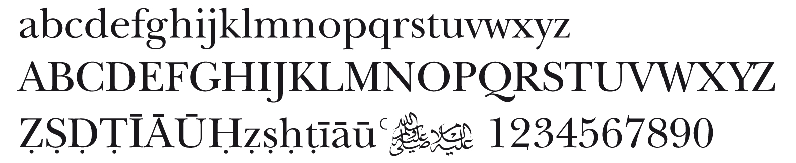
What radically changed things was the introduction of Unicode fonts in the early 1990s which recognised many if not all of the different transliterations in the many roman and non-roman languages in use all around the world. A truly global undertaking. So suddenly most of the  marks we were having to create were available in these new fonts. Also these new font formats allowed for up to 15,000 characters per font whereas previously only 256 characters were available (the ascii set) which necessitated substitutions and juggling to fit in the extra characters. Unicode has revolutionised computer typesetting and particularly the availability of what are called pro fonts which give you every variation of a particular typeface in one font….previously necessitating several fonts to accomodate what you needed. But still the powers that put this together (Xerox, Microsoft, NeXT, Apple and Adobe et alia) unbelievably left off the dotted consonants necessary in arabic translations. (see illustration above) This has meant having to edit the new fonts to create the necessary new glyphs. Also the ayn symbol, a small superscript c, has to be edited into the set.

Mustafa Kamal Attaturk, in the spirit of modernisation after the fall of the Ottoman Caliphate, forced the Turks to change overnight, Nov 1 1928  to be precise, from an adapted arabic script to a roman text, reading from left to right, adding all sorts of diacritics to cope with the spoken Turkish language. He and his accomplices wanted to close the door to its 1,000 year Muslim past and open the door to the Western world. This must have been traumatic for the nation, even though Attaturk himself still went on handwriting his own letters in scripted old Turkish as did many Turks right up to the 1960s. The old scripted Turkish had made an adaptation of arabic to encompass the particular Turkish consonants and vowelling, so to then change into roman script was another huge jump for the populace. Confusing one might think, but in one generation people do adapt – if compelled to. My prediction is that these new transliterated letter forms which we have introduced into the roman alphabet in the last fifty years will in time, maybe 50 years, become absolutely the norm and will be learnt as part of the established alphabet. This must have happend in Iran where arabic was adapted to accomodate the Persian consonants and vowels which don’t occur in pure arabic and which are now absolutely part of the language and now used  by 26 other languages in Asia like Tajik and Urdu.  If we tried to write English in an arabic script (I’ve tried it) we would be faced with the same dilemmas with having to borrow some Persian conventions and even inventing new ones for some of our odd noises. If you have ever tried to read alhamiado, archaic Spanish written in arabic script you would appreciate this problem. (see below) So the form that a language chooses to write in has huge political, religious and social consequences.
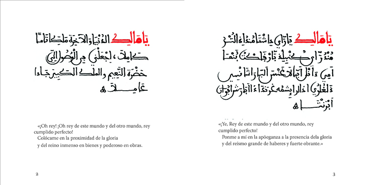
Above you see a pilot project undertaken by the poet Emin Alzueta in Spain and myself, which is a page spread of the poem The Beautiful Names of God by Ibn Abbad of Ronda, (1333–1390) a famous Andalusian saint now buried in Fes. Top left is the original Arabic. Top right the Alhamiado version (archaic Spanish) and below right, the romanised old Spanish and below left the modern Spanish translation. The Alhamiado version is a copy from a manuscript found in Spain executed in Andalusian script. To own anything written in arabic script (even Spanish) in post Islamic Spain was severely punished by the Inquisition but such things are still surfacing having been buried in walls and floors of old houses for centuries. The Spanish have their own transliteration system for arabic translations, just slightly different from the English system.

A side subject to this, about which there is considerable disagreement, is the bearing that right left and left right scripts have on the brain and whether this preconditions anything. The Chinese wrote from top to bottom originally and the Ancient Egyptians wrote left to right, right to left and vertically. and the ancient Sabeans and Safaitic cultures wrote boustrophedonically, which means that they wrote from right to left, followed by a second line from left to right mirroring the letters and then back again on the next line in normal writing and so on changing alternately.  It would be an interesting way to write a book and quite easy given the capability of current computer layout programmes. As to why one would do this –  I have absolutely no idea!

These few words barely touch on this complex subject but I hope shows how utterly fascinating it is . When you begin to un-peel written language forms it is like making a postmortem of human history. You see where humanity went and where it is going.

Posted in language, miscellaneous, Publishing, typography / design, Uncategorized | Tagged , , , , , | 3 Comments

The Meccan Rebellion

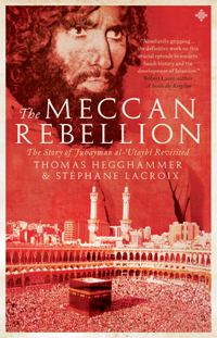
A new book, The Meccan Rebellion, by Thomas Hegghamer and Stephane Lacroix  has just been published by Amal Press, Bristol, and typeset by yours truly (not the cover I should add) and is now on sale. To quote some of the blurbs: “A skillful and scholarly blend of the theological , historical and contemporary contexts to the storming of the Grand Mosque in November 1979. It offers insight into Saudi religious politics … essential reading for students of Islam and Terrorism Studies (Professor Max Taylor). Also “Crucially documents some of the key doctrinal and legal disputes which divide the various Salafi schools in Saudi Arabia.” (Abdal Hakim Winter).

This is not intended as a review but I have read the book and it was surprisingly interesting. Recommended for the ignorant Sufi who glares across the room at the suspected Wahabi, as it explains the intricate history of how, for instance, the Salafis came into existence as the Al-Jama’a al Salafiyya al-Mutasiba in the mid 1960s in Medina under the influence of Muhammad Nasir al-Din Albani, intent on purifying what they perceived as innovation and misconceptions of the official Wahabi establishment and also in other influential groups like the Muslim Brotherhood and the Tabligh Jamat.

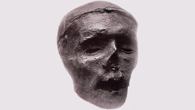
The mummified head of Cromwell

It seems once you are committed to enforcing a puritanical path, like Oliver Cromwell, it never stops until you yourself are completely purified i.e dead – rather like Oliver Cromwell, whose severed head sat ignominiously on a 20ft spike above the Houses of Parliament for many years before being taken down and sold off in a junk shop and and finally buried in Sydney Sussex College, Cambridge in a secret location. A warning to religious fanatics everywhere who want to purify everyone.

Of course The Meccan Rebellion focuses on the occupation by Juhayman al-Utaybi and his followers of the Haram and the subsequent siege. Unfortunately the man they believed was the Mahdi (identified in a dream by al-Utaybi) was shot and killed after three days of fighting which rather punctured the plan….  In 1997 in Jeddah, I met the Eritraen Idrisi Shaykh, Muhammad Abu Bakr, may God reward him, who narrowly escaped the siege and the taking of many hostages, by climbing out of a window in the Haram as the siege began. Bullet holes still remain apparently in the walls from that event. Like Oliver Cromwell, once they had surrendered, sixty of al-Utaybi’s followers were executed – they had their heads cut off.

I’m not that interested in history really having been hauled unwillingly around too many  Norman castles in Wales in my youth, but The Meccan Rebellion was peculiarly fascinating as its subject matter impinges directly on all of us and is an essential background to dealing with extremist currents in the modern world and understanding their roots. The only other historical book which I have found equally gripping is David Fromkin’s great book A Peace to End All Peace about the creation of the modern Middle East. It covers the period of time just before the fall of the Ottoman Empire right up to the mid 1920s. I found it utterly fascinating as it showed so clearly the great mess of history and the fog of both war and peace. No-one should look at the modern world and what is happening on a daily basis without referencing it.

Posted in miscellaneous, Publishing, typography / design, Uncategorized | 1 Comment

The Fly of God

Have you ever wondered why a mosquito or a fly lands on your face at precisely that moment in the early dawn when you know you should wake up and get out of bed? Did you swat it or did you thank it for waking you? In over 40 years of crossing that rubicon of consciousness from the dream world into this world at dawn in order to pray, I have always marveled at the obedience of these creatures following their orders from above – “Wake that man from his sleep!” is the command from on high! I once had a wonderful tabby cat called Louis who at every dawn would amble into my bedroom and lurk very near my head. He knew I knew he was there and if  I didn’t wake up and get out of bed he would whack me on my head. How could I be annoyed with him? After all he too was just obeying orders; an innocent creature.

We all know enough theology to believe implicitly in the decree of God, that everything is intended, everything is written, and that the ink is dry and that all things happen by divine decree and fore-knowledge – and yet we still utter things like ‘Good Luck’ and ‘Touch Wood’ as if life is just a random lottery. Which is why it seemed important to view that fly waking me at dawn as intimate divine attention and not to see it as anything else.

I have only been robbed a few times in my life and it is not pleasant, as anyone who has experienced it will tell you. You feel shock, violation, loss, anger, humiliation and other unpleasant emotions. I might have even entertained notions of physical revenge but not knowing the criminal involved it was a pointless idea. But in rationalising the experience you eventually have to concede that the Lord of the Worlds permitted them to break into your car or into your house and that there is not much you can do about it. Maybe it was a tax on your property for not giving out enough.

For about eight years in the 1990s my wife and I ran a tiny sub-post office in Cambridgeshire and I employed various devices to protect it from thieves as I knew that a post office was a soft touch, carrying a fair amount of money at most times. I placed an ayat al kursi above the entrance as well as reciting it around the whole property. We had no burglaries over the whole time we were there but I know that the people who took on the post office from us had several break-ins over the following two year period they were there. Coincidence? I think not. Another one of those phrases we use all the time…” just a coincidence”.

I’ve learnt now to see everything that happens as having meaning and that there is no such thing as a random event. Even to the point that if I am in a hurry driving my car and the car in front is slowing me down, I can now accept that I am being slowed down deliberately and probably being saved from some accident (another of those words!) which I might have been hurtling towards. As was pointed out to me many years ago by a friend: don’t hurry to the airport to catch a plane, as when you are crashing down from 30,000 feet you’ll be cursing yourself for having hurried to catch it. Food for thought.

Once understood, all this explains just about everything and it’s a very useful knowledge to have in my opinion. It explains where your food comes from, where your work comes from, where your provision comes from, provision of food for the body and food for your eternal soul. Every single little thing that happens in your life in other words good or bad.  This is really the secret of relief from anxiety and to be content with one’s life. And here is another secret, trivial though it may appear. It’s how to find a parking place for your car when you cannot easily find one. Just say out loud and sincerely ” I totally give up looking for a parking place.” See what happens. For me it rarely fails.

Lord of all flies. Lord of all parking places.

Posted in typography / design | 9 Comments

Olé

A usted‘ is the reply you will often get in Spain when thanking a tradesman or a shopkeeper and it always brings with it a smile. A small but significant courtesy. Usted (or its arabic forerunner ustadh) is the formal ‘you’ or plural form of the pronoun. Of course anyone who knows any arabic will recognise ustadh immediately as the common term of respect for a teacher. I’m not sure how many Spaniards know of its Arabic provenance (although the connection is remote) but that could be said of several thousand arabic words embedded in the Spanish language. Eight hundred years of spoken and written arabic couldn’t be wiped off the map and out of the hearts of the people as simply as King Ferdinand and Queen Isabella and the Catholic Church believed it could in 1492. In fact so much remains of Muslim civilisation in this country but just under the surface so that most of the population are quite unaware of it. Another Arabic-Spanish word I like is rizme from which the English word ream (500 sheets of paper) comes, signifying a bunch of paper in its original arabic. Many similar words are in common use and subconsciously, I believe, reconnect the people on a daily basis with their roots. In much the same way as all language does. For example, in English, earthy words like mud or blood, link us instinctively and unthinkingly to our Saxon heritage. We all lie hidden under our tongues.

And many would agree (except the Bishop of Granada) that its Moorish history is what gives Spain its unique character. The Bishop believes Spain is really a Visigothic culture by tradition, vanishing somehow eight hundred years of Islam and I just don’t know how he figured that out. What a chump. The evidence of Moorish culture in Spain is just about everywhere if you know where to look and I’m not speaking of the Alhambra, Cordoba or Sevilla (which is proof enough). It’s in the place names eg Gaudix = Wadi ‘Ash; or Lanjaron = Ayn Harun. Or in the food Paella= Baqilla, a food normally served on Thursdays in old Andalusia with the leftovers of the week before the big lunch on Fridays. Which is what Paella is…a mix of just about everything, bits of fish, clams, chicken and vegetables all mixed with soggy rice in saffron. If Spain has a national dish, that’s it and definitely of Moorish ie Muslim origin. Or it’s in peoples’ names: eg Ishmael, Nuria or Fatima. But then the Spanish go in for curious names. If you were born on a particular Saint’s day you took on the name. Hence strange names like Expiracion or Incarnacion, quite common Catholic female names. So as a name, Ishmael or Fatima is not going to seem so odd therefore.

I’ve mentioned asequias (another arabic word) in a previous post, the irrigation systems as a living tradition from earlier times. The list is endless. We are continually finding little hidden gems of Moorish times. One of these is a tiny little mosque in a small town called Fiñana on the road between Guadix and Almeria, the north side of the high Sierra Nevadas about three hours drive from us.

Many churches used to be old mosques but in this case the mosque is acknowledged as a mesquita and although it is now officially a Christian shrine it is not used as a church but opened one day a year to exercise the effigy of Jesus that sits inside. But the interior was restored in the 1980s very sensitively and the mihrab and its quranic alabaster work preserved well. You can only peep through a glass window at all this but its columnar layout and qibla direction indicate that it is quite clearly a mosque. On its floor plan an octagon can be seen quite clearly behind the mihrab which must have been the minaret. An unusual octagonal minaret can also be seen in central Valencia. I don’t know of any other octagonal minarets anywhere. Fiñana also has an Arabic baths and a Moorish castle dating from its Almohade past. But it is well off the guide book trail. There are quite a few other similar secret mosques and minarets around Spain but which are also not on the tourist routes.

When my wife and I first came to Spain eight years ago we had many questions about unwritten Moorish history which mostly we couldn’t get answers for. The things which had, against all odds, survived down time. Some we knew had their own little secret stories about, for example, relatives who had been crypto-muslims and who had been performing vestiges of the prayer or wudu in secret for hundreds of years in secret. There are quite a few other such histories. But these were just anecdotes, un-researched and hard to confirm, and they will probably remain as legends. And of course as the older people die out these stories die with them. But where there was a little smoke, more than likely there was a few embers of truth.

But it is in the language you sense the living traditions of a thousand years ago most and even more so when you see the calligraphic evidence in the few qur’ans preserved from that time. Completely readable it as if they were written yesterday. Recently I showed to a group of twenty-five Spanish design students in Granada, on a large screen, a page from an illuminated Quran from around a thousand years ago written in Granada but now in the Stadst museum in Berlin. Its beauty impressed them but what impressed them more was that I could recite the clear arabic script to them. It was like a message sent to them from the past – their past not mine. On a recent visit to the Alhambra museum I saw (behind glass of course), parts of two immaculate handwritten medieval Granadan qur’ans and it is as if they were calling out to me to be liberated. Even more so because the ayats were quite clear and ones I knew….words cannot express my feelings. Well one word can – Allah. In Spanish – Olé.

Posted in architectural, language, miscellaneous | Leave a comment

Relics of the First Computer Age


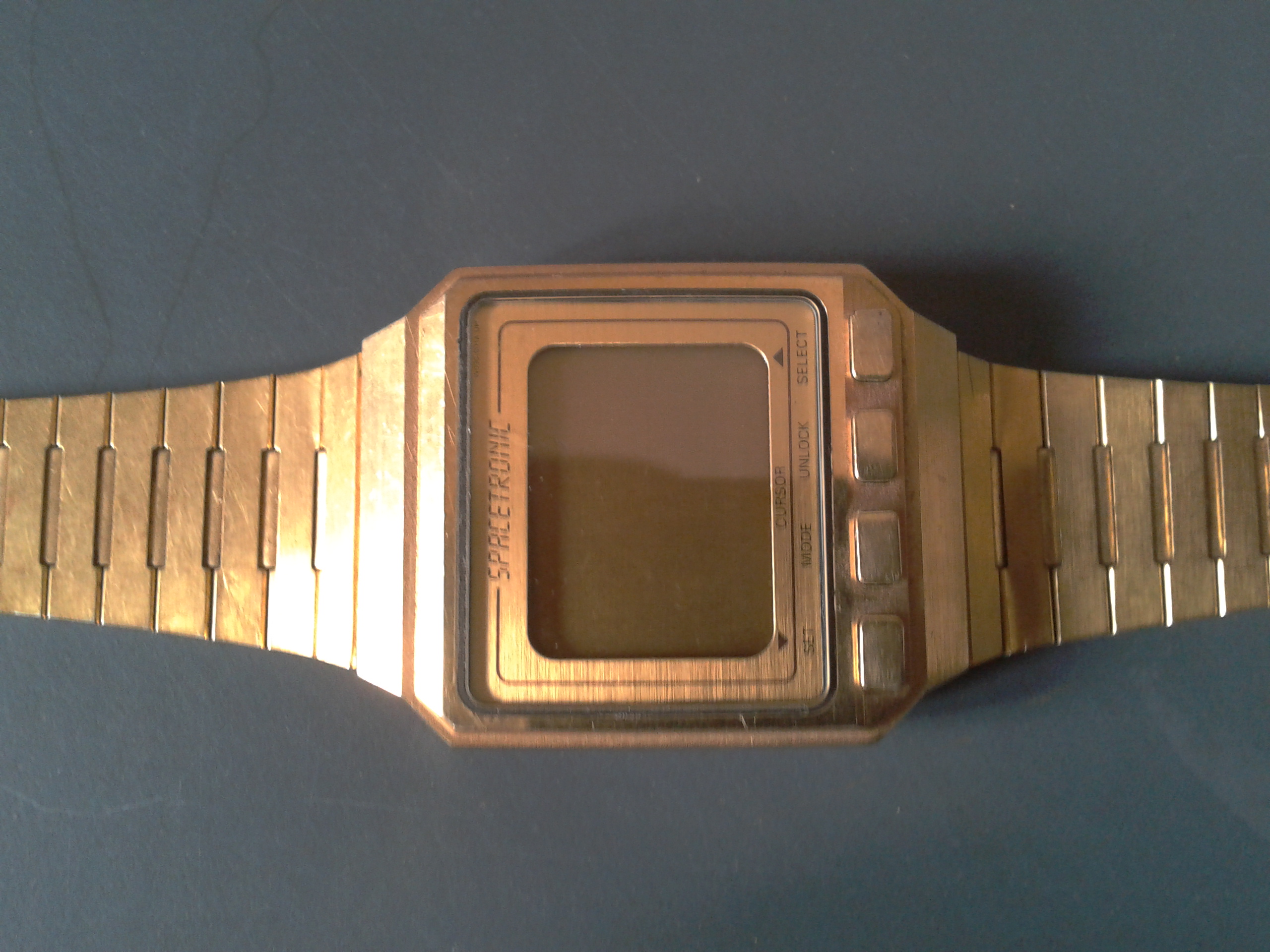
I just discovered in an old drawer a unique Seiko digital prayer wrist watch made in about 1986 in Japan. What’s more it’s gold plated which makes it pretty unique. How quickly things seemed to have moved on from that time through the 1k Spectrum computer to the sleek 27″ desktop flat screen computers we use almost universally now in the developed world (ie those who can afford to buy one). Back in 1986 I was working for an advertising agency near London who were handed the account to advertise the new Seiko Spacetronic watch which had the Muslim prayer times for most cities in the world programmed into its micro chip. I had to publicise it as best I could and we did a launch in London and got front page in the Guardian with a short article which, if I remember right, registered interest mixed with a bit of amusement or was it sarcasm? I also had to organise an interview for ITV by reporter Mark Austen, with the Egyptian inventor of the watch, Ibrahim Salah (I think this was his name). The example I had was a sample (one of several) we had in the office which I appropriated when the company went bust.

Prayer clocks at that time were nothing new but were mostly fairly primitive affairs imported from Pakistan or China with analog dials and usually with the recording of a call to prayer intermingled with bird song and running water – presumably to get you out of bed a little more quickly to run to the bathroom. But the idea of a prayer wrist watch was quite unique. I don’t believe it was a commercial success but was unique enough to be placed in The National Museum of Australia.(Object number 1995.0009.0001) So if they are reading this, maybe they would like my watch to add to their collection. All offers considered.

In 1986 in graphic studios we still used galley proofs, Letraset and wax machines and scalpels to stick artwork together. So in 25 years or more we have left all that behind for the comfort of a screen and mouse. And I really don’t miss it. But for those who were born 30 years ago they did miss it completely in a different way. But all that drawing board work taught you a lot about type and how graphical things are constructed. We also used pens and pencils much more and such things as RSI and carpal tunnel syndrom were unheard of. The most we suffered from was back ache leaning over a drawing board. Seeing the graphic in front of you in a tangible form on paper has its plusses. The virtual world of the computer can be very misleading.

Now in 2012 we have our personal prayer apps for our smart phones which call the prayer in a style of your choice (Makka, Medina, Cairo) or in the case of one app your own recording. It is slightly disconcerting to hear your own voice doing an adhan in the dark of dawn or more so if you are sitting talking to a doctor (as happend to me) and have the thing go off in my pocket…Allahu Akbaaaaar…….. The app even knows where you are and the correct times. It is a far cry from judging the time of the middle prayer by the shadows, something which should not be forgotten, but I confess to a certain dependency on this kind of gadget (bless its little circuits) as it is a real reminder of these cosmic moments through the span of the day.

All very useful in fact but a reflection too of how atomised and scattered we have all become with our personal muezzins calling us to prayer in our own homes or offices. Outside of the Muslim lands a public call to prayer is rare and in places like lovely old secular France probably illegal. In Granada you will hear the adhan (not amplified I might add) called out at all the prayers except the dawn prayer, in the Albaycin, the old Muslim quarter of the city. But without a PA it is quite faint but audible even half a mile away, if there is not too much ambient noise. Not so in Istanbul of course where the amplified adhans thunder down every street leaving you in no doubt. The power of such a thing meant that Liam Neeson the actor became fascinated with it when filming in Istanbul recently, to the extent that he was considering embracing the religion!

It is quite sobering to see something in a museum like the Seiko prayer watch, which was once a novelty gadget to marvel at – now just a useless piece of metal. A reminder that we will all qualify for a museum in the not too distant future in the Relics of the First Computer Age section.

Posted in typography / design | 5 Comments

Cosmic contradictions

Global-warming deniers are crackpots as bad as those who thought the Earth was flat, according to Sir Andrew Motion, the new president of the Campaign to Protect Rural England (and ex-English Poet Laureate). It’s interesting to me that to consider the Earth is flat is perceived in this most disparaging way – by a poet of all people. And I’m no global warming denier or Flat-Earther.

If you didn’t know the earth was a sphere you would naturally believe it flat as what we see is a horizon all around us i.e. the edge of a flat earth. Climb up high enough and it quickly starts to curve. I once went up to 60,000 feet in Concorde and yes, I can assure you the earth is definitely curved at that height. (11 miles up). So I can safely assume that as you go higher it gets more and more curved until it becomes round. Now I’m no scholar, my only qualification being an honours graduate of the madrassah of hard knocks, so I thought it wise to ask those more knowledgable than myself. Is the earth flat or round? Answer: it’s both.

So according to sacred law the earth is flat (so I am told), which is why the times of prayer are defined by the setting and rising of the sun over the perimeter of what is the flat disc that we all perceive wherever we live. In the desert at night the sky is seen as a vast hemispherical chronometer and guide which moves slowly and majestically over our heads…whereas we know that scientifically the earth is spherical, rotating and moving itself through the cosmos.  So, Mr Motion (appropriately named methinks), it’s not that simple. If we know the earth is a sphere why then is the rising and setting of the sun so critical. (and of the moon come to that). But our human experience, unless we are orbiting in a satellite, is of the daily event of sunrise and sunset,  so for the purpose of prayer it is definitely flat. Someone tell me if I have this wrong.

So the great cosmos of sun and stars we see is, in other words, just a giant astrolabe to orientate us to the direction and times of prayer. We weren’t some accident who happened upon the universe of planets, stars, suns and moons in some random fashion like a bunch of time travellers who landed in space vehicles. It appears it was all made for us. In the open deserts of Mauritania or Morocco this sight must be truly awesome. Where the constellation Orion rises over the horizon is also, according to the Mauritanians, the direction of prayer – i.e. Makka. I’ve tested this in Spain and it holds true but I don’t know if this applies elsewhere in the world.

This touches very much on the heated disagreement in North America about the prayer direction (fascinating as it is peculiarly American). Some intelligent American scholars I know have seized upon a football or a balloon and a piece of string to illustrate how the polar route is the shortest route to Makka as if our prayers are like aeroplanes. In view of what I have previously said about the flat earth disc and sharia law, I wonder if they are missing the point. Fortunately where I live in Andalusia we are not faced with this dilemma. The aggressive selling of the “scientific” viewpoint in the last century makes it yet more difficult to see the wood for the trees and to have a balanced viewpoint. We have to all relax and learn to live with this paradox as every year when Ramadan arrives the whole world community divides on its disagreement about another very cosmic thing– moon sighting.

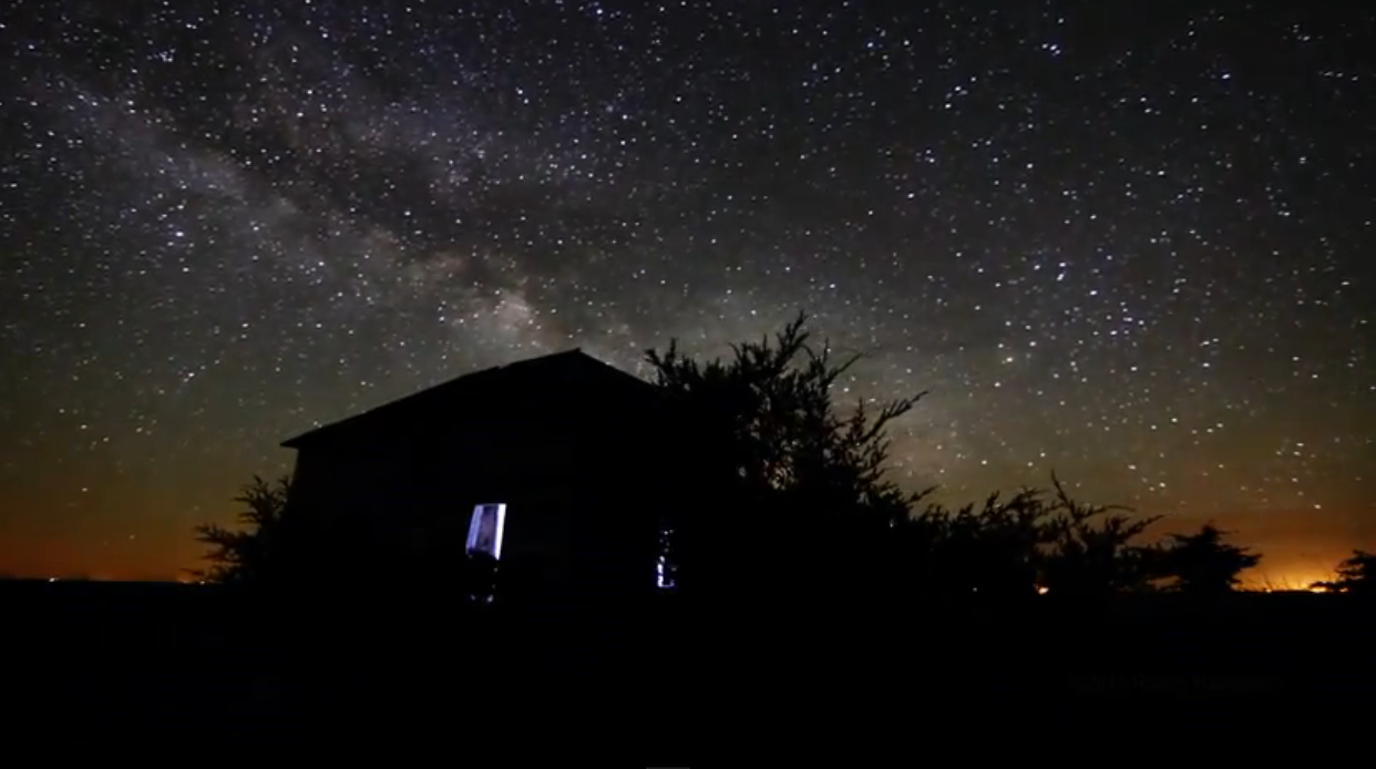
§ See http://dakotalapse.com/ for a selection of awesome cosmic time lapse movies (illustrated above) of the milky way.

Posted in miscellaneous, Uncategorized | 1 Comment

Be Near the Earth

Be Near the Earth is a phrase that caught my eye some months ago on a Zaytuna College web page. Sh. Hamza was quoting the advice of a Mauritanian shaykh he knew and its many meanings I thought worth expanding upon.

I imagine that many muslims who might be reading this are urban dwellers and more than likely born and raised in an urban or sub-urban environment. I suspect many such folk are more comfortable in such environments and find the country slightly threatening. The words “I’m a townie” have been spoken to me many times. And as far as being close to, and part of the society, Muslims seem to have flourished in the urban context. Indeed in Andalusia it is well known how civilised the medieval Muslim cities of Cordoba and Granada were, with street lighting, drinking water flowing to private houses, hundreds of bath houses and many of the creature comforts we associate with the post Victorian industrial age.

But compared to the modern tarmac roads, motorised transport, electric power, town gas and high rise apartments (very far from the earth), the medievals lived much nearer the earth. For a start their cities were limited in size so that people had access to the countryside and the dependence on horses and animals, meant closer daily contact with the natural world and a big involvement with e.g. olives which gave them oil for lighting, food and its wood fuel. And pickles. The dwellings were in general one or two stories. The technological world, necessary though it is in this time, has made most people sacrifice their daily proximity to nature. And as someone who at one point in time suffered from a surfeit of computer use and car driving (trapped nerves, posture problems, eye strain) I’ve had to find a more acceptable balance between the demands such things as the computer and cars were making on me and the obligation I have to my own physical and spiritual health. A better balance is always the more productive solution. One German architectural firm I know of, found that if its workers lived next to a garden into which they could constantly walk, they worked better and were happier and healthier. This is a lifestyle I have adopted now for many years now. Mixing my office work with gardening, wood chopping and other kinds of recreation. Enjoyable. Who needs to retire?

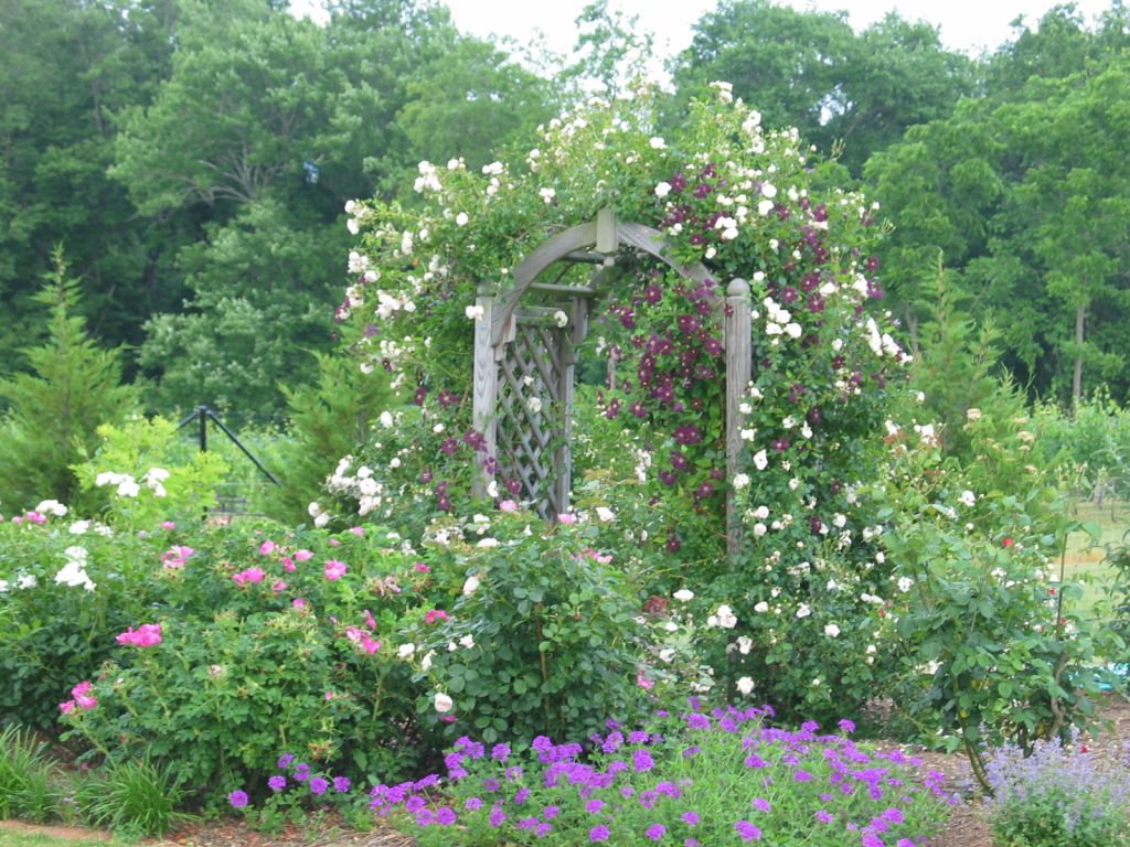
Be near the earth for many is literally touching plants, digging in their gardens, handling soil, planting seedlings, manure, composting etc., and you can do that not only in the country and the suburbs but increasingly in cities, on roof tops, waste land and on balconies. It’s an activity that keeps you in tune with the cycles of the day, the seasons and the miracle of seeing seeds sprouting through the earth. The reality before you of the many Quranic ayats about God bringing forth life from dead earth. Good exercise, better and cheaper food and the grateful use of wasted ground space.

But even for those who are born and brought up or who can afford to live right out in the country, there is often utter disregard for any kind of harmony between man and nature. In fact my last memories of walking in the Essex countryside, before high tailing it to Spain, was of constantly avoiding enormous farm machinery spraying poison or chemical fertilisers on the exhausted earth. These spraying tractors had enormous extensions which would unfold at the commencement of their work like a giant mechanical spraying mantis.  The word Koyaanisqatsi meant in Hopi language “unbalanced life” or man out of tune with nature. In this case fat cat corporate farming.

But even up here in the secret valleys of Andalusia some folk seem far to eager to abuse the countryside and by extension themselves. I am told that 25 years ago the valley of the Alpujarras was almost wiped out by the use of DDT. It killed wildlife in a big way purely so the greedy little farmers could see weed-free olive groves etc. After it was banned, wildlife returned, but still you see little men walking around spraying their trees from a tank on their back– it just looks so odd. Trees are vulnerable to some insects and disease but there are effective ecological ways of dealing with these problems.

Probably the farmer activity I find most offensive and one I consider very far from the earth is what is called strimming, or what Americans call weed-whacking. Many times I have thought the strimmer was something straight out of hell sent to test my patience. For hours on end I would have to endure the perpetual stop-start whine of the strimmer as a neighbour went up and down his land hacking down the weeds – oblivious of his violent intrusion of the peace. The operator is covered with protective head gear and gloves like something out of a bad horror movie, and is amazingly disconnected from what he is doing. A quite dangerous activity too. One local man lost an eye doing it and I have been showered by stones when driving my car as council workers strimmed the roadside. A strimmer doesn’t cut, it smashes indiscriminately.

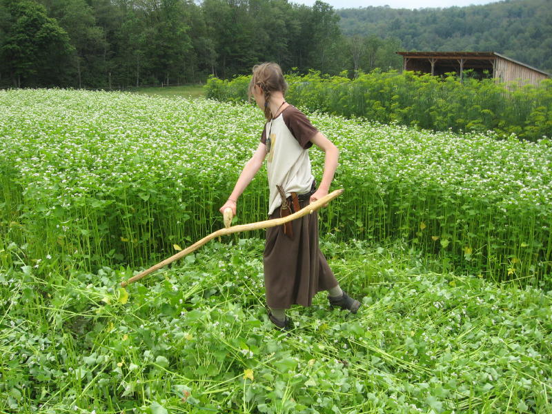
What the strimmer replaced was the scythe, the ancient, dignified and very effective way of cutting, grass, weeds and of course wheat. All that is needed is the scythe (much cheaper than a strimmer/weedwhacker) and knowledge of how to sharpen it and some muscle. Who knows how to sharpen anything anymore? Many believe an experienced scyther can easily keep pace with a strimmer any day. But the hard pressed farmer is sold these ‘labour saving’ devices and has to keep up with his neighbour. You can’t even buy a scythe round here now.

This is the model to me of man far from the earth. I’m not a romantic and would accept that in certain situations the technological solution is appropriate. I drive in cars and fly in planes though rarely these days, and only when absolutely necessary. But because I really loathe the mechnical solution doesn’t mean I don’t make concessions – but I make the concession fully understanding that the other way is preferable. Sometimes I think I am fighting a lonely campaign against people willingly drowning in technology, lemming-like. I often reminded calligraphy students of mine what would happen if tomorrow they couldn’t go and buy paper, pens and ink in Rymans’ or Kinco’s or wherever you get your writing supplies. Could they make it themselves? If you had no electricity could you survive or would you just curl up and die. My thesis has always been that the ‘near to the earth’ solution is not only sustainable but actually better than the hi-tec solutions. A matter of quality over perceived technological advantage. In previous posts I have harped on about PA systems, disappearing calligraphic styles, musical modes and so on. It’s all connected.

Posted in typography / design | 4 Comments

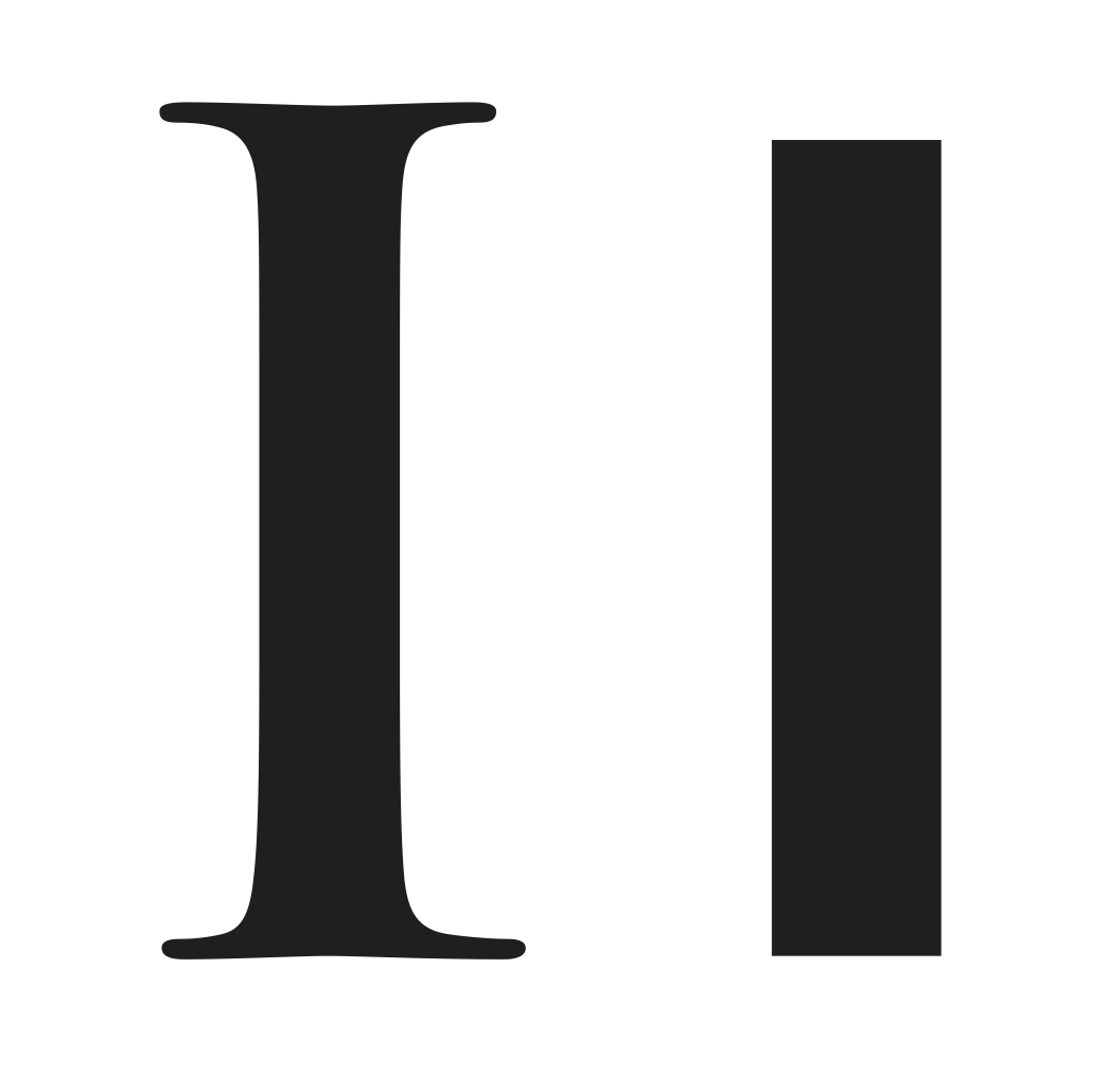
To Serif or not to Serif?

There was a time when to make something look cutting edge you just avoided serifs, those little embellishments on a letter of type that stops it looking like a block of wood. It was that simple. Helvetica as opposed to Times, News Gothic as opposed to Garamond. I’m talking typography again but this wasn’t the only realm in which the modern look shaved off ornamentation and embellishment for a fashionable stark machine finish.

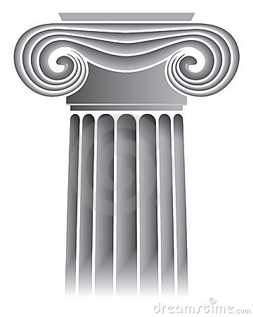
This is just an example of the popular conception of modern, and was so, even a hundred years ago or more. But what was, or is, modern? If modern is really another word for new, how come the really modern styles began in earnest as early as the first decade of the 20th century. Indeed modern was new – once. It’s a semantic problem no less, but with an interesting history. The modern age heralded air travel, high rise
buildings, machines, a clean swish look, devoid of decoration or the fanciful use of, for instance, the capital of a column – the architectural equivalent of choosing non-serif Helvetica over serifed Times.

The way the public perception over the course of the 20th century was eased into the use of type without serifs marked a sea change in culture. Which is why we look at things like the type used in the London Underground and we think ‘how new’ but it’s almost a century old, designed by Edward Johnston in 1916. The same with slab serif faces like Rockwell which are timelessly new – contradictory though that may sound. Modern was a style just like any other style.


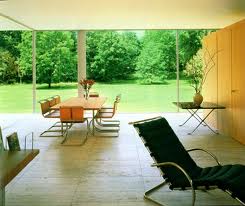
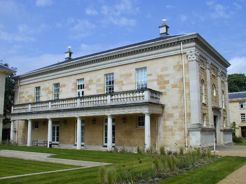
‘Modernism’ surrounded me at the Architectural Association in London, back in the 1960s when I studied there and it was a creed that few wavered from. It was a diet of Le Corbusier (above: Ronchamp), Mies Van de Rohe (below: Farnsworth House) and Buckminster Fuller et alia, and just about all the student work reflected this, my own included. It was the fashion, although the theme of teaching was always ‘meaningful spaces’ and ‘structural language’ etc., and much which was quite beyond me of architectural mumbo jumbo. However, one student in my year stuck to his guns and only designed in classical architectural styles, whether it was a petrol station or a vast hospital and he has done very well by all accounts, designing in the said classical styles for particular clients. Of course in these times some architects specialise in classical architectural styles as there is a demand for it. Others specialise in Gothic. Prince Charles’ favourite architect, Quinlan Terry has designed  important extensions to several Cambridge Colleges (eg Downing College: below) in classic styles much to the chagrin of competing  modern architects. Anyone who reads the newspapers must be familiar with Prince Charles’ on going spats with the modernist lobby, some of whom I have known and who rile at his championing of the traditional.

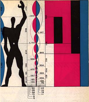
Modern Cambridge college architecture, like the Halls of Residence at Queens and the Faculty buildings on the Sidgewick site are monuments to the vast egos of modern architects like Norman Foster, James Stirling and Colin St John Wilson whose buildings represent to me a kind of eccentric and barren desperation with none of the feeling of beauty that Le Corbusier’s buildings inspired in me. Although the polymath Le Corbusier could be accused of just setting a ‘new’ fashion, which which was aped so badly and inappropriately all over the world, his own designs had their roots in an understanding of Greek proportion and his own humanistic proportional system, the Modulor (left) , based on the proportions of the human form. And he did all that with only one eye. This idea approaches sacred geometry in a way, the human form being of sacred design. It gave a human scale to every aspect of his designs. Although I know of no religious leanings he might have had, basing his Modulor on man approximated unwittingly sacred proportions as man is of nothing but divine origin. The head, arms, hand, foot, legs, torso and feet are all of divine design and nothing if not traditional.

The Cambridge Faculty of Divinity (St John Wilson), The Law Faculty building (Foster) and the History Faculty (Stirling), all next to each other on the Sidgewick site, are individually totally paradoxically un-functional buildings in different ways and have suffered many user complaints over their short life and have needed very expensive renovations since opening, in the case of the Divinity and History Faculties.

But the worse thing is that they look like redundant dinosaurs of vanity and ‘modern’ egocentricity plonked into an ancient university city. These building symbolise to me all that is wrong with this heartless technocratic age, founded on money and prestige with no link to humanity or human scale, in any form, all encased in chrome steel and tinted glass. How ironic that the Faculty of Divinity has no place of worship in it! It used to have its own chapel in its old premises on Trinity Street some years back. Why does the History Faculty building reflect nothing of history but looks like a curious L-shaped glass roofed factory built of industrial red brick? And why does a law building have to look like Stansted Airport or a city bank?

Divinity Faculty: Left
Law Faculty: Left Below
  

In the 1980s the Bin Laden Construction Company in Saudi who were responsible for the reconstruction of the Haramayn, offered me a job of removing human beings, by computer pixel replacement, from photographs of their new buildings like some kind of photoshop neutron bomb. Speaks volumes doesn’t it? I also worked on a fascinating film for the same Saudis about Medina and the men who worked on the original extension of the Prophet’s Mosque back in 1948. The film was rejected because it was about people. So it’s a pretty universal disease, this ‘modern’ dehumanising tendency.

As usual on these issues I find myself standing in the middle of the road, a dangerous place to be, as you get swiped by cars going in different directions. I find minimalism praiseworthy and I understand the reaction to the lavish visual and romantic excesses of the Victorian Age, but on first seeing medieval mosques in Morocco I saw how tradition and simplicity could marry perfectly together and how geometric decoration like zilij (anathema to the modernists) can be scintillating, elevating and totally integral to the building. How the modern architect loves vast uninterrupted surface. No clutter, no humans, no colour, no pattern. Visual puritanism.

Alexi Sayle, the seditious comedian and writer, wrote a little known short story (from The Dog Catcher) about a representative of this genre of architect, whose house is a modern sanctuary in Belgravia with glass staircases and no clutter but whose wife secretly rents a council flat filled with her plants and fluffy animals. Alexi bites deep into the hypocrisy of the modern architect and from my own first-hand experience gets it dead right. The universe of Alexi’s architect collapses dramatically when he finds someone has written Kilroy Was Here on his pristine exterior road facing wall. This hypocrisy needs deflating really badly but to challenge it now is to open yourself to a barrage of hate.

I don’t approve of everything the Prince does but at least he fearlessly confronts faceless, corporate culture and its hideous constructions. His rather anodyne neo-Georgian buildings are a welcome change from the general trend of techno-industrial brutalism but only a well-heeled minority appreciate it or can afford it or even care. Soon I hope he will be attacking HS2, the new pointless (excuse the pun) high speed railway line proposed through central England. All strength to him I say. This £30 billion white-elephant-to-be is like giving an old man with a nice wrinkled face a lobotomy and plastic surgery in the hope he might run in the Olympics. Britain is being systematically and senselessly strip-mined to satisfy corporate balance sheets and faceless, cultureless men in the city of London. (and the unions!) As one wit observed, HS2 will, on completion in 2025, drag Britain into the 1980s which is when most European and Asian countries began comparable high speed train services.

So those little serifs are well worth the trouble. Sans-serifs have their uses and can be beautiful but you have to keep a watchful eye on them. Serifs are like the eyelashes on the human eye. Without them the eye looks all wrong.

Posted in architectural, miscellaneous, typography / design, Uncategorized | Tagged , , , , | Leave a comment

The Psychological Study of Typography

This might all be a bit arcane for most people but as everyone these days reads typeset text (when did you last get a handwritten letter?) then it’s just as well you know what underpins the science and craft of typography. It’s right that I should return to this topic as of late I have been diverted into all kinds of rantery on unexpected subjects.

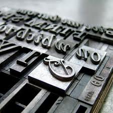
Hand composition: In the early days (like 4-500 years ago) at the inception of typesetting, many of the rules of type were defined by practical considerations of hand composition like the width and length of metal segments, whether actual characters or blank line spacing (ie leading) and the options were very limited. There were no rules really. Whatever sufficed. It was an imitation of what could be done very skilfully by hand. But with all this new 21st century digital gadgetry at our disposal, we can dial in absurd point sizes like 25.578pt if needed, which leaves the process of hand-set type so far behind but also opens the door for an unholy mess. Computers were not initially created for design use but as business machines, and their use of type initially was horrendous. The ubiquitous Times New Roman and Palatino, fine typefaces in the right hands, were thrown to the masses as they were included in every PC sold since 1985, and the result was typo-anarchy.

e-books: With e-books you can now adjust the size and style of the font and whether the text is left, right or justified. One dyslexic I know of, claims that his inability to read easily was because 99% of typeset text is justified, creating a continual variation of inter word space which can confuse the eye. With Ipads, Kindles etc you can adjust the text till you can read it with ease whether you are a child, middle aged or elderly, each group requiring a different size type. You must have seen in your local library large text books for children or for old people. But there is much more to a comfortable, even inspiring reading experience than just point sizes and word spacing. Which is why a lot of designers are unhappy with what e-book readers are giving to us all. Read on.

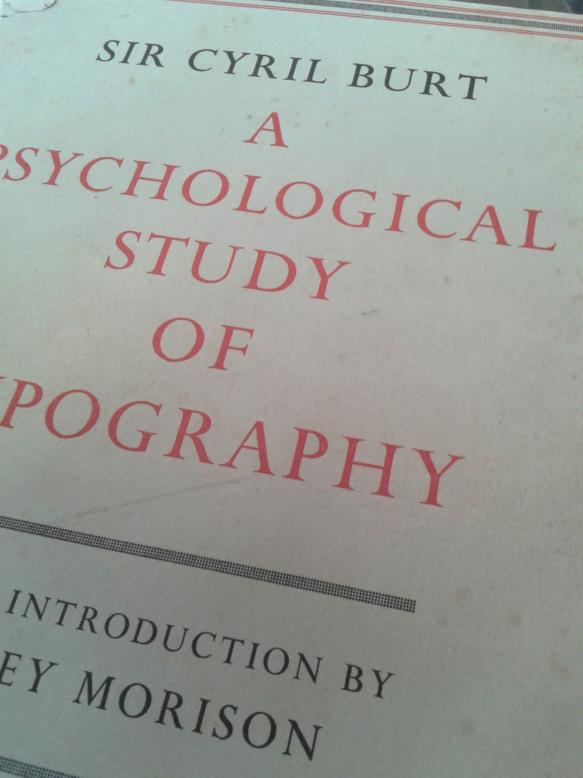
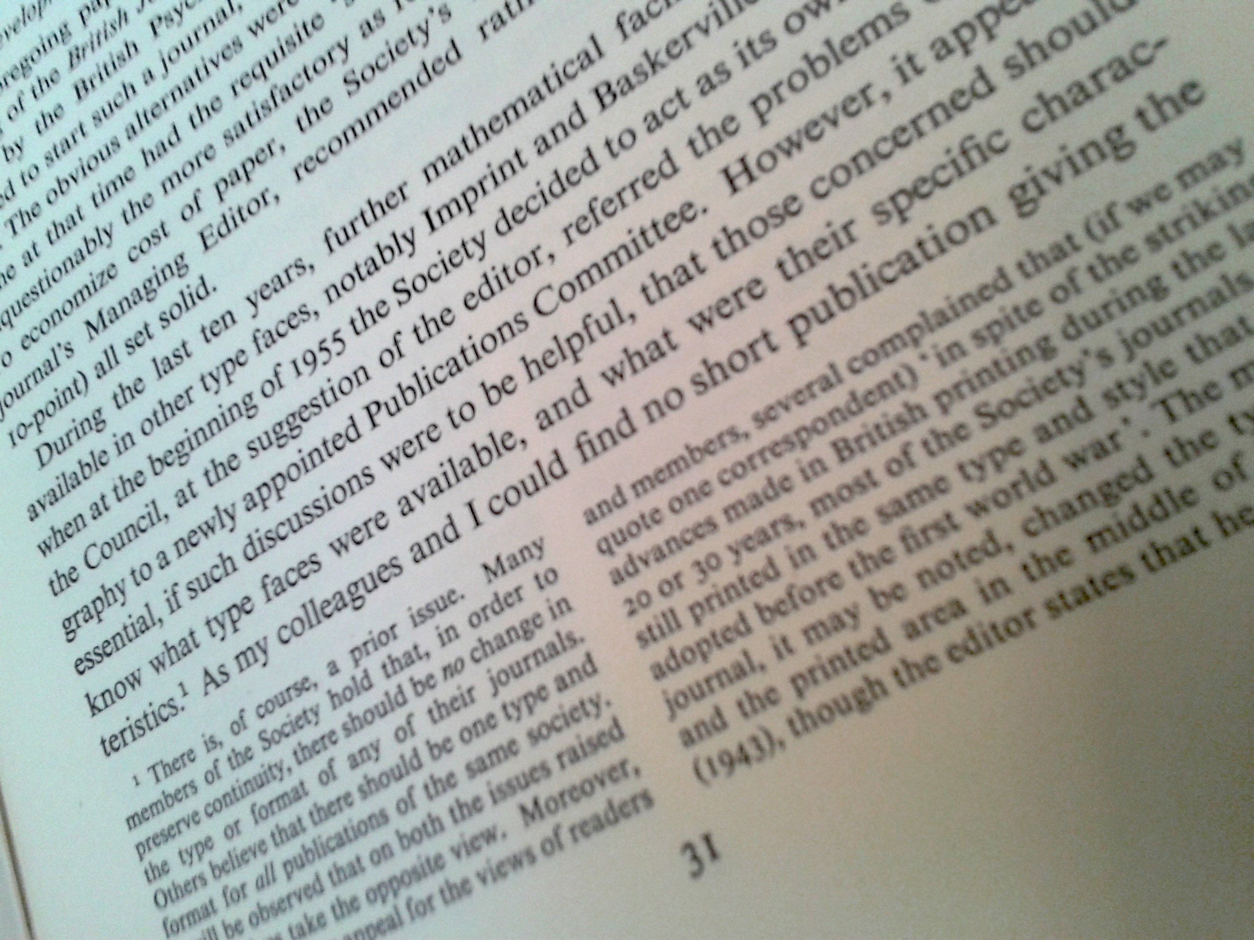
I’m relating some of this from an excellent and long out of print book by Cyril Burt, printed in the mid-1950s in the UK by Cambridge University Press—The Psychological Study of Typography. The book itself, finely designed and typeset in hot metal and printed on quality slightly off-white cartridge is an example of the classic (and timeless) school of typesetting to which I firmly adhere and which makes reading (and typesetting) a pleasure and not a chore. He does appraise a few of the text faces available at the time 60 years ago but more than that, he gets right into the exact process that is going on as your eye scans the page leaping from word to word and from line to line and what tires the eyes and what doesn’t. Cyril Burt’s book is meticulously set in Times New Roman, the most common of fonts, and it’s as you have never seen it used before. No coincidence that he found it the most readable of typefaces in his researches. I realise that times have changed and that the common man has been given a power that was confined to specialised trades in the past. Which is why it is important that the common man now gets to grip with some of the knowledge hitherto hidden in trade print shops and typesetting studios.

He determines the relative optimum line length and leading for given type sizes and the essential ‘colour’ of the text i.e. lack of what are called ‘rivers’, white gaps caused by excessive inter word spacing, all to provide an easy reading experience. Even the density of the ink is critical to the reading experience. How the text sits on the page enters the realm of golden section ratios, the age old traditions of page design (influenced by hand scripted bibles) and in some case just what the publisher can afford in term of real estate. Publishers of trashy airport thrillers will often print on as much of the page surface that is decent and on the cheapest paper available. Most publishers will admit to having to make compromises on print area as wide margins put up the price. There are no fixed rules on this but a page of text (and or images) either pleases and is readable or it isn’t. Cyril Burt’s book is a guide and in a sense does lay down rules. But as with everything, rules have to have meaning and a purpose and often stretched where appropriate.

A summary of the intent behind the book could be stated thus:

  • Using tests of speed and comprehension, we have studied the influence of type-face, boldness, size, interlinear spacing, length of line, and width of margin on legibility both with children and with adults. The results have furnished provisional norms for children’s reading books and for scientific journals such as the present.
  • Factorial methods, supplemented by an analysis of introspections, appear to yield a classification of both readers and type faces based on aesthetic preference; and the data incidentally obtained throw considerable light on the reasons for such preferences.

If this subject really interests you, I suggest you look for an original edition on the internet – for a price between $30-60. It is a specialised subject but one of these these subtle things that impacts on our daily lives. Useful knowledge in other words. This applies equally to the typesetting of arabic as well.

Posted in typography / design | Tagged , , | 3 Comments